Please do not underestimate the importance of a proper frame for your painting or fine print. Framing is an important design decision that can either enhance or diminish your art viewing experience. The framing decisions you make will not only affect the look of the artwork and the environment into which it will be placed, but its long-term well being as well.


How the artwork will be used can inform frame choice. If it is framed for a collection or museum – because it will most likely be moved from place to place over time – the most important consideration is that the frame compliments, enhances and protects the artwork. If it is to be installed in a commercial setting where it is most likely permanently placed, in addition to helping to enhance and protect the artwork, it needs to fit in with the overall design of the room.


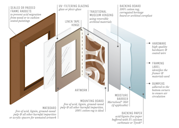
For your artwork to have the best chance of retaining its value, it is best to be sure that the frame shop you have chosen practices archival framing techniques. Essentially, Archival or Conservation framing means that anything used in the framing of an artwork will not damage the artwork over the long term and will, in most cases, help to protect it. This is most important with works on paper.
How to find a good Framer?
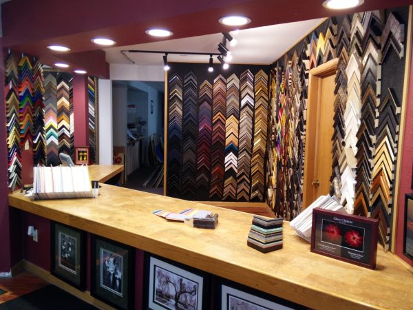
If you are working with a designer, they will most likely have several framers they regularly work with to recommend for your specific need. If you are not working with a designer, and you feel uncomfortable making this type of decision yourself, a good frame shop will normally have an experienced person on staff who can assist you in making good framing decisions.
One of the best ways to find a good framer is to contact several art galleries around your area that do not have framing departments and ask them who the best conservation framers are in the area. Although conservation framing is more expensive, the extra expense will pay off down the road.
How to help the framer help you get the most suitable frame?
For a framer to be most effective at suggesting proper frame designs for your artwork, it is best to not only take the artwork to the meeting, but to also take:
• Photos of the entire room in which the artwork will reside
• Measurements of the wall onto which the artwork is to be hung
• Information and visuals on how the artwork will be lit.
And if the artwork is to be hung over a sofa, a chest, or a fireplace mantle:
• Be sure to provide the height of the object the artwork is to be placed above
• Provide the height of the wall above the object to the ceiling molding above.
Following are a few things you may want to avoid or at least think about when choosing a frame for your artwork. I was going to call this section “Framing Don’ts” but as with just about every rule in this world, there are always exceptions.
Over-framing:
Over-framing can relate to the disproportionately large size of a frame to the artwork it surrounds, or the inappropriate ornateness or finish of the frame related to the period, style, and subject of the artwork. Sometimes, to make a small artwork appear more significant looking, a much larger frame (or mat-and-frame combination) is employed, sometimes to the point of totally overpowering the artwork. I have seen this technique used often on late impressions of Rembrandt etchings. To make them more important looking, a small etching is surrounded by a complex frame, often 10 to 20 times the size of the actual etching.


Under-framing
Under-framing is when an artwork is not provided the frame it deserves. For financial and sometimes practical reasons, artists who paint in oil and acrylic on canvas will either not frame or put strip molding around the artwork to protect the artwork’s edges, assuming that the person who buys the painting will frame the work to their own specifications. Some galleries will not frame any of the work they have for sale of this type for that same reason.


The 50/50 rule
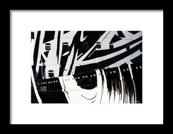
This rule pertains to the width of two-part frame assemblies, that is, a liner to its frame or a mat to its frame. The rule states that both these elements should never be perceptively the same width. So, the mat width on a fine print should never be, or look, the same width as the frame that surrounds it. If the mat was there first and it is decided that it is to be kept, the width of the frame that is chosen for the work needs to be significantly smaller or larger to feel right.


Formal/Informal
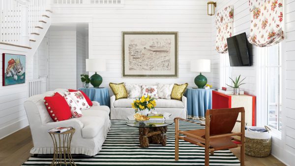
In most cases, like clothes, it is usually appropriate to dress an artwork to fit the room in which it is to be sited. This means the room will often dictate the type of frames that will be appropriate to choose for that space. It is normally inappropriate to put a driftwood frame above a Louis XV gilded commode in a period room.

Keep original frames
Frame styles change with the fashion and period in which the artwork was created. Sometimes the original frame on an artwork does not fit a contemporary space so it is decided that the frame needs to be changed. Separating a period frame from an older artwork can actually reduce the value of the artwork. If it is decided a change of frame is necessary, it is wise to store the original frame so it can be reused later.
There is a lady who owns a major American modernist painting for which the artist personally made and decorated the frame. She personally disliked the frame, so she had the painting re-framed to suit her home and the original is stored at a local art warehouse. The painting is loaned out to museum shows with great regularity and when it is, the art movers take the painting to the warehouse, change out the frame to the artist’s original frame, and send it out to the museum. When it returns, the process is reversed, and the painting is returned to her in the frame she prefers. If she had discarded the frame, she would have thrown away many thousands of dollars in value.

*****
To see all available FAE Design Blog Posts, jump to the Design Blog Table of Contents.
To see all available FAE Collector Blog Posts, jump to the Collector Blog Table of Contents.
Sign up with FAE to receive our newsletter, and never miss a new blog post or update!
Browse fine artworks available to purchase on FAE. Follow us on Facebook, Instagram, or Twitter to stay updated about FAE and new blog posts.
For comments about this blog or suggestions for a future post, contact Kevin at [email protected].
Other FAE informational posts you may find helpful:
Fine Art Insurance 101
 Practical Tips for Safely Transporting Artwork
 Temporarily Storing Artwork: A Case Study
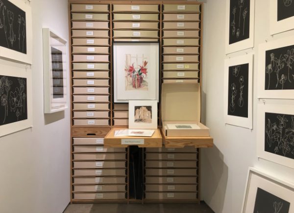 Four Artwork Storage Solutions
 Hanging and Framing FAQ’s
 Siting Sculpture, Part One: Overview
 Siting Sculpture: Part Two, A Case Study
 The Importance of a Proper Frame
 When to Use UV Control Glazing
 Reflection on the Problem of Reflections
