I am fascinated by artists whose main form of expression is through painting, but are drawn to try other art forms, like printmaking. Many artists who explore printmaking on their own, and who come from a background in painting, are often not concerned with the same conventions that apply to most printmakers. They approach creating prints in the same way they do their paintings. I call these artists: Painter/Printmakers.
Collection of the Art Institute of Chicago
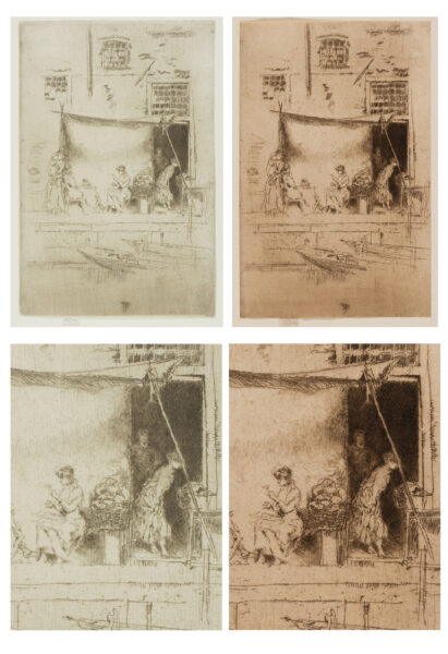
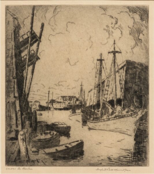
We know that Whistler printed both of these proofs because he left a tab on the bottom of each of these prints signed in pencil with his famous butterfly, followed with the letters “imp.” This means that Whistler impressed or printed the proof. You can see how selectively the artist wiped the ink off the plate before he printed the plate.
Historic Examples:
Through the history of printmaking, most artists who tried their hand at the medium were painters first. They were often supported by tradesmen who editioned prints for artists, made reproductions of paintings, or produced illustrations for books, and it was their job to try to make each print they produced look the same. But, when painters like Rembrandt Harmenszoon van Rijn, or James Abbott McNeill Whistler produced and proofed their own prints, especially when using an intaglio process, they were more interested in exploring the visual effects the medium had to offer than creating clones.
Over the last 125 years, many painters who wanted to explore the printmaking mediums started by making monotypes because it is more like painting, and some jump directly into one of the major printmaking categories of either Intaglio, Planographic, Relief, or Stencil. When they do make the leap, many will find a Fine Art Press or locate a printmaker who is willing to work with them. If they enlist a professional, after they have created a matrix followed by a final press proof known as the bon á tirer (good to print or pull), they decide how many prints they want to make up the edition and the number they want outside of the edition. Although it is impossible to make two hand-printed proofs look exactly the same, it is the job of the professional printer to make every proof look as close to the bon á tirer as they can.
If, instead of using a practitioner, a painter decides to try their hand at printing their own edition, they are often more interested in exploring the possibilities of the technique they have chosen than following convention. These are the artists I call painter/printmakers.
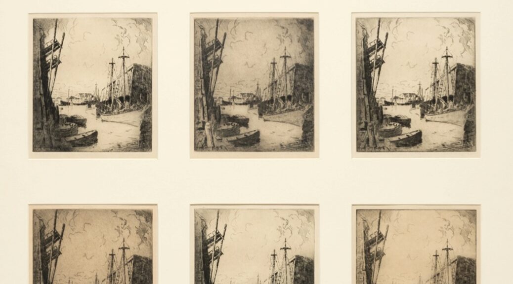
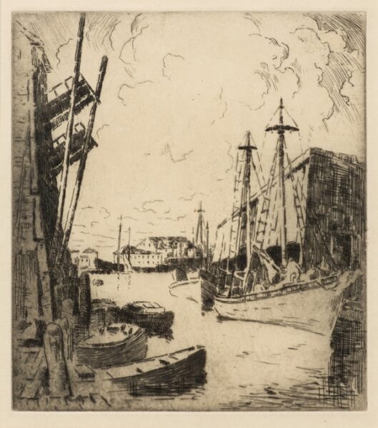
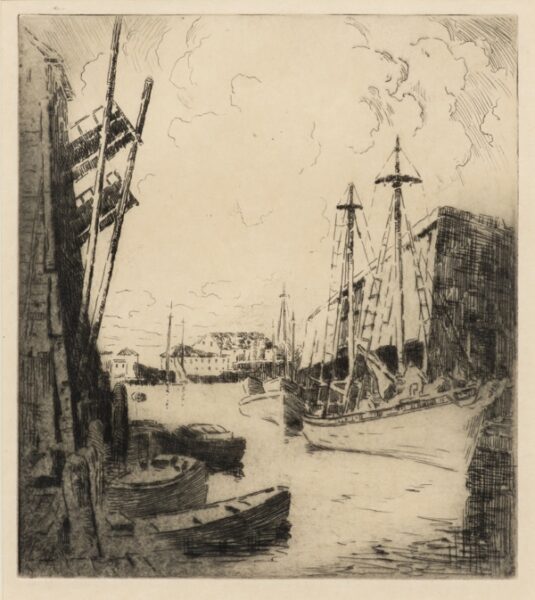
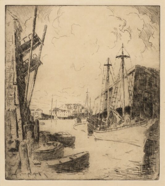
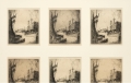
This is an example of how an edition might look when printed by a painter/printmaker. These images show how Breckenridge selectively inked and wiped each proof to create different visual effects.
The Painter/Printmaker Hugh Henry Breckenridge:
A good example of this type of artist would be Hugh Henry Breckenridge (1870-1937). Breckenridge taught painting at the Pennsylvania Academy of Fine Art for 25 years and then took a teaching position as Director of the Department of Fine Art at the Maryland Institute in Baltimore. He explored both lithography and intaglio printmaking while at his summer school in Gloucester MA, but it was the latter that showed his disinterest in convention.
Although it appears that his etching technique was straightforward, his printing methods were those of the classic painter/printmaker. Since he was a painter at heart, the idea of printing image after image, duplicating what he had done before, would have been boring, and his disinterest in doing so becomes obvious when one is privileged to see many proofs of the same print together.
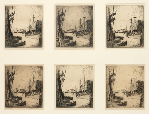
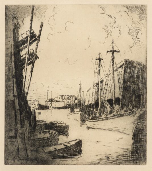
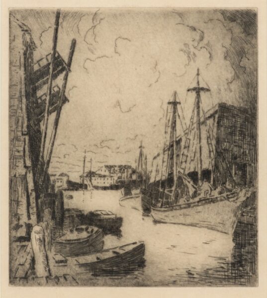
Evidence for my claim can be seen in his self-editioned etching, Across the Harbor, 8 x 7 inches, edition of 50, printed in 1923. As a painter, Breckenridge was interested in the effects of light and dark that could be achieved through the different ways he inked and wiped the plate before he printed each proof. He was exploring his ability to control the atmosphere of each print, depicting different times of day where shadows and light are used to emphasize or diminish an object’s importance.
They show how the artist changed the lighting and atmosphere in each of these prints by how he inked and wiped the plate between proofs.
It is unusual that a painter/printmaker would have gotten so interested in exploring the inking possibilities of a single print that they would have created an edition of 50. I do not believe he had intended such a large edition when he started printing, I think he got so immersed in the painterly effects selective inking offered, he could not stop.
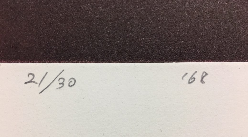
Breckenridge continued to be unconventional when he numbered the edition. Normally, after an edition is declared, any prints beyond that would have normally been designated as A/P’s or artist’ proofs. In this case, Breckenridge just continued numbering the prints after he reached the end of the edition. So instead of ending with 50/50, he numbered three more proofs 51-53/50 respectively. Although irregularities are sometimes found in the editions of professional printmakers, they are more commonly found in the work of Painter/Printmakers, who are by their nature, less encumbered by convention.
A Collectors Perspective:
If a collector only sees one impression of a print by an artist, they will probably not know whether the artist played with the inking of a print matrix during its editioning or not. This is only obvious by seeing multiple impressions of the same print. They would have to rely on a catalogue raisonné of the artists’ work, see other images of the same state in auction catalogues, or in Museum collections to know for sure.
For some collectors, acquiring a print that was pulled by the artist who created it is of more interest than a print pulled by a pressman who is hired to print an edition. This does not mean that professionally editioned prints by contemporary artists are not as good. A good pressman is trained to get everything the matrix has to offer and what their client says they want. Prints that are pulled by an inexperienced printmaker can be over or under inked. But by their very nature, the fact that the artist has placed their name on it and maybe given it an edition number means that they are personally satisfied with the result.
For a painter/printmaker, it is the exploration of a print matrix’s plasticity that fascinates them. They are drawn to take a process designed to create like artworks, and instead, see how many ways they can make each final print different, yet stand on its own. Rather than trying to duplicate a perceived perfection as is the goal of the professional printmaker, the painter/printmaker attempts to create a different state of perfection with each proof they print.
More Examples:
The following are images 3-6 of the 6 images seen together above. They show how proofs from the same plate can differ just by the way the plate is inked and wiped. This level of variation is strong evidence that they were printed by a painter/printmaker.
*****
To see all available FAE Design Blog Posts, jump to the Design Blog Table of Contents.
To see all available FAE Collector Blog Posts, jump to the Collector Blog Table of Contents.
Sign up with FAE to receive our newsletter, and never miss a new blog post or update!
Browse fine artworks available to purchase on FAE. Follow us on Facebook, Instagram, or Twitter to stay updated about FAE and new blog posts.
For comments about this blog or suggestions for a future post, contact Kevin at [email protected].
Other FAE informational posts you may find helpful:
 Documenting Your Art Collection
 How Do I Get My Art Appraised?
Fine Art Insurance 101
 Practical Tips for Safely Transporting Artwork
 Temporarily Storing Artwork: A Case Study
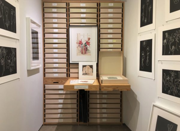 Four Artwork Storage Solutions
 Hanging and Framing FAQ’s
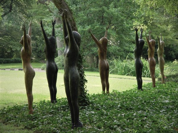 Siting Sculpture, Part One: Overview
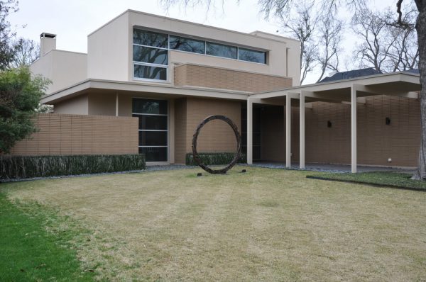 Siting Sculpture: Part Two, A Case Study
 The Importance of a Proper Frame
 When to Use UV Control Glazing
 Reflection on the Problem of Reflections
 The Value in Fine and Reproductive Prints
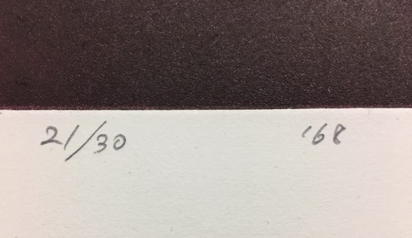 What Does That Fraction Mean on a Fine Print?

 Painter/Printmakers