Have you ever had a framer tell you that you can protect a work on paper from fading just by putting UV (Ultraviolet) protective glass or Plexiglas on the artwork? Even though your framer is normally the one that suggests when to use UV control glazing, what they tell you may be truthful without being accurate regarding its effectiveness in your situation. So, here are some suggestions on when to use uv control glazing to prevent artwork fading.
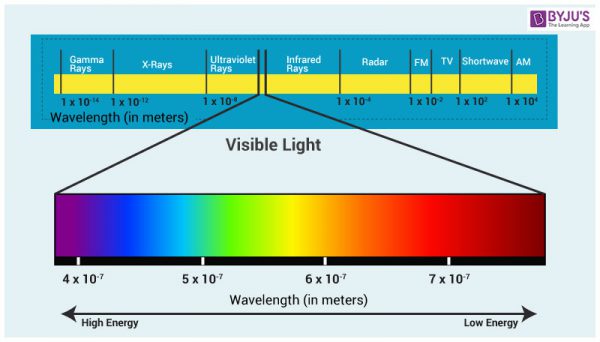
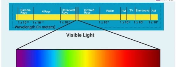
What your framer should have said is that depending on where a work on paper is hung, UV protective glass and Plexiglass can help protect it from fading. Ultraviolet light is the most damaging part of the light spectrum to fugitive pigments on paper and other materials that are prone to fading, like fabrics and furniture. High end UV protective glazing material is rated to block up to 99% of the Ultraviolet rays hitting an artwork’s surface. Just remember that UV may be the worst part of the spectrum, but it is only a small part of the spectrum that can cause damage. A greater issue is the overall amount of visible light that is hitting the artwork and the amount of time it is getting hit. Think of it as slow or fast fading.
• Little light over an extended period of time = slow fading
• A lot of light over a short time = fast fading
If a work on paper was to be hung in a lightless closet, with properly controlled temperature and humidity that is never opened, it does not matter if it has UV protective glazing or not as it will not fade, at least not from light exposure.
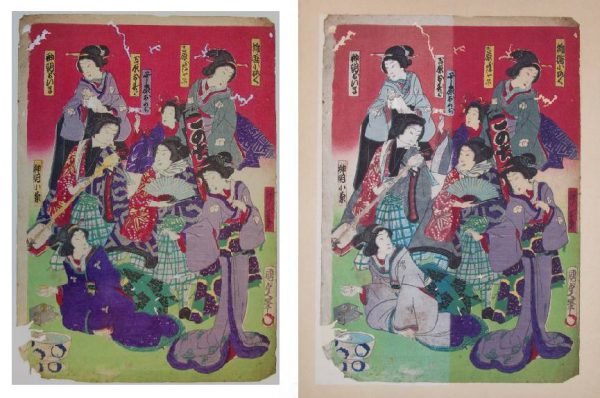
If a work on paper is hung in a bright living room with big curtain-less picture windows looking out over a lake that reflects light into the room, even with UV glazing and protective windows the artwork will fade over time and the paper will darken. In the trade, when referring to the darkening of paper by excessive light, an art dealer would say that the artwork has been “light struck.”
For most light sensitive materials, light damage is cumulative and irreversible. So, what are the best ways of minimizing the effects of light damage to an artwork on paper?
Museums have different regiments they follow regarding the amount of light exposure each work on paper can have. Each work is normally evaluated to determine how sensitive it is. It is then assigned an allowable exposure schedule, amount of time it can be on view, and a maximum allowable light level for the duration of that time. For example, a sturdy work might be allowed to be on exhibit for 4 months at a specific light level and then rest for two years, or for 6 months at that light level and rest for three years. A more fragile work may require lower light and less time on view.
Don’t Panic! The Museum protocol I have just described is designed to meet the museum’s charge to protect what they have collected or are exhibiting. Your clients want something they can hang on the wall and enjoy for the next 20 years. So, to accomplish this goal I suggest the following:
• For works on paper that you or your client consider valuable and want to last as long as possible, definitely use UV protective glazing as it greatly reduces the most damaging aspect of the light spectrum.
• Hang in rooms with minimal light during the day like hallways or bedrooms that are not in continuous use and are normally kept dark.
• Keep lights off when rooms are not in use.
• If an artwork is hung in a room that has windows that allow a lot of light into the room during the day, add blackout curtains to the window that can be closed when no one is using the room. Codes for new buildings in most areas require that windows block a lot of the light coming in for reasons of energy conservation. This can greatly extend the life of curtains, rugs, and furniture as well as the art by reducing the amount and intensity of light entering a room and therefore slow fading.
• Have blackout fabric covers made for the artwork in rooms that 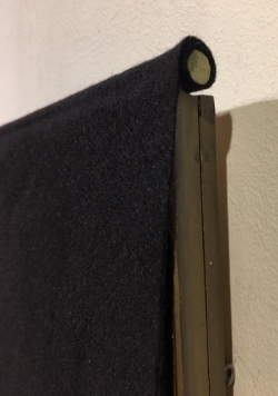 window curtains are not an option or skylights let light in that cannot be blocked. They can incorporate a weighted rod at the top that can be draped over the top of the frame with the fabric hanging over the front of the artwork. This will allow quick access to works when you want to view them and they can remain hung indefinably without overexposure to light.
• Keep these works out of often used bedroom bathrooms and kitchens. These rooms often are subject to high humidity and temperatures, and other issues with that I will address in a future post. They are also rooms that would normally be well lit and where you would not normally want artwork that needs protective covers to keep them from fading.
• Place UV tube covers over your fluorescent lights. Of the three main light sources in homes and offices used today – Fluorescent, Incandescent, and LED – Florescent light, for the same amount of lumens output, is the most damaging because it produces the most UV light.
• If LED lights are producing the same number of lumens as your incandescent bulbs do, they are causing an equal level of fading to your works on paper.
One of the main manufacturers of conservation-grade UV protection glazing is Tru Vue. They have an excellent highly informed and well-educated customer support staff. If you need clarification, again no pun intended, as to whether UV protective glass and Plexi will work in a specific application, give them a call.
Tru Vue help line: Phone: 708-854-2700
Email: [email protected]
Note: Not that it is my field but I was informed by the folks at Tru Vue that one of the most frequent calls they get is from signature collectors who have used their products and have had their valuable signatures fade from being out on display in rooms that have too much light. Their glass was doing what it was supposed to but many framers are often not aware that UV glass alone will not stop fading, it only helps to slow it down. The recommendations I have made above should help with this issue. Another interesting thing they said is that often, ink signatures seem to fade very quickly to a certain point and then the fading process seems to slow. So the maximum amount of damage happens in the earliest part of their exposure.
*****
To see all available FAE Design Blog Posts, jump to the Design Blog Table of Contents.
To see all available FAE Collector Blog Posts, jump to the Collector Blog Table of Contents.
Sign up with FAE to receive our newsletter, and never miss a new blog post or update!
Browse fine artworks available to purchase on FAE. Follow us on Facebook, Instagram, or Twitter to stay updated about FAE and new blog posts.
For comments about this blog or suggestions for a future post, contact Kevin at [email protected].
Other FAE informational posts you may find helpful:
Fine Art Insurance 101
 Practical Tips for Safely Transporting Artwork
 Temporarily Storing Artwork: A Case Study
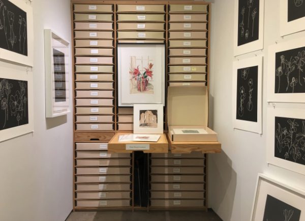 Four Artwork Storage Solutions
 Hanging and Framing FAQ’s
 Siting Sculpture, Part One: Overview
 Siting Sculpture: Part Two, A Case Study
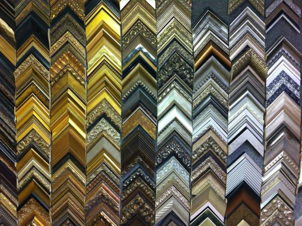 The Importance of a Proper Frame
 When to Use UV Control Glazing
 Reflection on the Problem of Reflections