Category Archives: Highlighted

What Does That Fraction Mean on a Fine Print?

One of the most common questions asked by new clients when they purchase a find print from me is “What does that fraction mean on a fine print?”  They are referring to the fraction, often written in pencil, most commonly found at the lower-left bottom edge of the image or platemark.  I have written three short essays to hopefully bring a little clarity to the subject.  I have also provided a link to a glossary of terms related to the editioning of fine prints.

Part 1:

An overview of the things that you may find helpful to know regarding the modern editioning for fine prints and what the fraction, found in the margin under the image, actually refers to.

Part 2 :

A short case study regarding the editioning of a series of old master prints by Albrecht Dürer (German, 1471 – 1528) called the Apocalypse.

Part 3:

An overview of what I found when I was trying to determine what fine print publisher or which artist was the first to use a fraction to describe the print number and the edition size that is now the universal format.  I cannot say I found the first, but I did find an 1895 reference point that will be a benchmark to beat in the future.

Part 4:

A link to a glossary of terms related to types of proofs and related nomenclature. You are welcome to download this Word file and keep it as a reference.

Note: In conveying the information below, you will see that I have qualified almost every example I have used related to editions or a fraction’s numerator and denominator. This is because in every case described below, in the 40+ years I have been dealing with fine prints I have personally run across exceptions, but they are rare.

Part 1: Numbering and Edition Overview:

After a number of prints have been produced by or for an artist, it is a standard practice to use a fraction to identify both an individual print and the number of like prints the artist has declared that will then constitute an “edition.” With few exceptions, this fraction is written in pencil beneath a print’s image at the lower left or lower center margin by either the artist or the publisher. There are several misconceptions as to what the numerator and denominator of this fraction mean related to the edition of fine prints and I hope the following information is helpful when looking for fine prints for your clients.
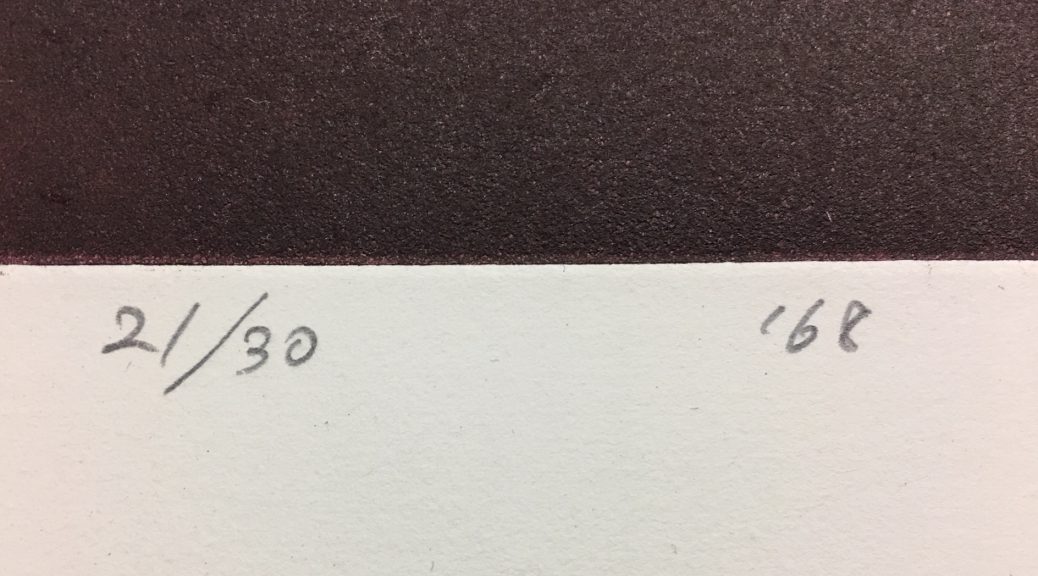
Fractional edition number with date. This is the print designated as number 21 in an edition of 30.

The Numerator:
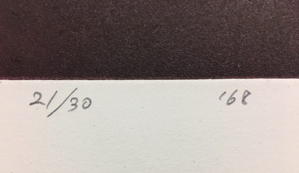
Because written definitions of what the numerator represents are often imprecise and ambiguous, they can easily lead someone to erroneously believe that the numerator indicates the sequence in which the prints of that edition were printed. (i.e. if the fraction written on an etching is 5/25, this would indicate that this print was the 5th print pulled off the plate in a total edition of 25.) In truth, this number does not relate to the print’s printing sequence but is only a cataloguing device, a way of identifying print 1 from print 2, etc. The odds of this print being the 5th one pulled from the plate is, for various reasons, more than 1 in 25.

It is most often the case that the earliest prints off a plate, stone, or block, depending on the technique used, are often considered by collectors and curators to be better and therefore more desirable impressions than those printed later. This is due to the wear and tear on the matrix from repetitive printing.  What is almost in all cases not true is that the numerator of the fraction can tell you if a print was an early impression or not; only its superior quality compared to other impressions of the same print can do that.

The Denominator:
The Denominator of the fraction relates to the total size of the artist’s declared edition of like prints. The term “like” prints is important here as it means that the only thing that is different about each print when the edition is finalized is the numerator of the fraction. Everything else, the paper type and size, the inking of the matrix, and the way it is numbered and signed are all the same. It is important to remember that the denominator just indicates the size of the allowable edition, it in no way substantiates that editioning was completed after its size was declared. It is often only the print documentation from the press that produced it, the artists print log, or a well-researched catalogue raisonné that can enlighten one as to how many prints were actually printed of an edition.

It was popular, in the case of well-known artists like Joan Miró, to have their press print multiple editions from the same plate or stone. For instance, Miró would sometimes authorize a second edition on a different type of paper. So, you might see a print by Miró on Arches paper in an edition of 250 in one place and the same print on Japan paper in an edition of 100 somewhere else. Miró would sometimes authorize a special small edition of a print to be published that was in every way like another edition except that instead of numbering the edition in Arabic Numerals, it would instead be numbered with Roman Numerals. The takeaway here is that there may be more than one edition of a print. This usually does not occur unless the artist’s market is big enough to absorb multiple editions.

With most any known declared edition, there are additional like prints called “prints outside of the edition.” Conventionally, beyond the edition defined by the denominator, a certain number of prints will be printed that will be designated as Artist Proofs. They are like the edition in most every way except rather than being numbered with a fraction, the letters “A.P.,” (épreuve d’artiste in French) or a variation thereof, are written instead. The number of A.P.’s varies with how many the artist wants to have printed but it is rare that they exceed more than 10% of the total edition size of like prints.

Again, in the case of Miró and other printmakers who were well known in the latter part of the last century, another type of print designation was used initially in Europe to boost the number of prints outside of an edition. On occasion you will see prints, instead of being inscribed A.P., inscribed “H.C.,” (Hors de Commerce) or a variant, that means amusingly “not for sale.” Prints with this designation can be found occasionally on the market but they were originally intended to be gifted and not sold commercially.

There are other print edition designations that I will not go into here as the chances of running into them while looking for art for your clients is unlikely. Below is a quick history of editions as they relate to old master prints and to the earliest usages of the fraction to indicate edition size. If you find that you have a question about something on a print that you don’t understand, send us an email with an image and we will get right back to you.

Part 2: Old Master Prints:

Dürer’s “Apocalypse” 1511 title page

Albrecht Dürer (German, 1471 – 1528) was one of the world’s most famous and important printmakers. He produced a series of fifteen large woodblock prints based on, and called, Apocalipsis cum Figuris, known today as the Apocalypse. Outside of proofs printed to test the image and those that were printed to sell or gift, in 1498 the fifteen prints that made up the series were printed with text, some in Latin and some in German on the verso of each image, and bound. Prints that appear on the market today from this edition of books are described as “from the 1498 edition.” This series brought Dürer great fame and notoriety. Because of the popularity of the series, it can be assumed that he continued to print individual proofs from the blocks until he published another bound edition of the Apocalypse in 1511. After that series, where individual prints are now known as “from the 1511 edition,” the woodblocks were printed as the market demanded until they had worn down to the point that they could no longer produce acceptable prints.

Dürer’s woodcut The four horsemen of the Apocalypse

Before Dürer’s time and well into the 19th century, the number of prints off a plate, stone, or wooden block was determined by either demand or the condition of the matrix used that allowed acceptable prints to be created. Today, we would call that an “open edition” because the edition size was not declared by the artist. In the case of Dürer’s Apocalypse, there are two actual editions from the same woodblock of each of the 15 Apocalypse prints and many prints outside of a known edition. When dealing with old master and 19th century prints, date of printing, quality of impression, condition, and notoriety of the image are directly related to the print’s value. In the case of these specific Dürer images, as well as many other old master prints, editions and other proofs can often be dated by the paper it was printed on and the watermark it may bear.

Part 3: When the Numbering of Fine Prints Became Popular…

Most likely inspired by the rare book trade, consensus leans toward the idea that it was the fine print publishers in 1890’s France that started numbering the prints of the editions they published. One of the best known and most important printmakers during that time in Paris was Toulouse Lautrec who was a prodigiously active Lithographer from 1891 to 1900. By using the catalogue raisonné Toulouse-Lautrec: The Complete Prints by Wolfgang Wittrock as a reference, a window is opened into the innovations and practices regarding print numbering and editioning during this period. Here are my takeaways:

• Lautrec signed a small number of his prints but although many of his prints are numbered, it is believed that he did not do this himself; they were most likely numbered by the publisher. In many cases, just under half or just over half of the prints were numbered. The number system most often looked like “No: X” and written in pen or pencil. In some cases, stamps were used to number the prints. It is not clear why only half of an edition was numbered as it creates a very ineffective inventory system. *1

Lautrec’s “Mademoiselle Marcelle Lender” color lithograph

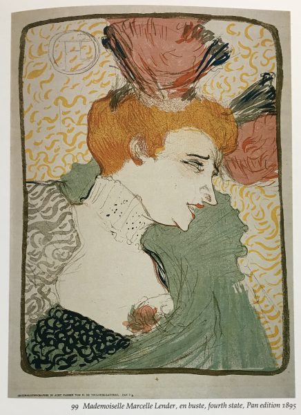
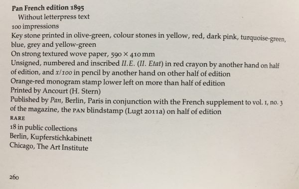
• The states (prints that show developmental changes) and edition sizes of most of Lautrec’s prints are known but the edition size was rarely indicated on an individual print.  In reviewing all the print entries in Wittrock’s book, there are only five times that a fraction was used to indicate both the prints assigned number and the number of prints in the edition. The first time a fraction was used on a Lautrec print was 1895 on half of the Pan French Edition of 100 prints of Mademoiselle Marcelle Lender, en buste, (Wittrock 99.)

Wittrock’s entry for the Pan French edition of Lautrec’s “Mademoiselle Marcelle Lender” color lithograph

*1 – Today, fine art presses will often publish artists’ prints by offering them studio space, possibly room and board while they are working, and then printing an edition of what the artist produces in exchange for a percentage of the edition. This way a press will have an inventory of prints by artists they respect, and the artist keeps the rest of the edition.  It is known that most all of Lautrec’s prints were sponsored by the publisher and very few print editions were paid for by him. This may account for the fact that often, only about half of his prints’ editions were numbered by the press.

Part 4: A Glossary of Terms Related to Types of Proofs and Related Nomenclature

Back in 1989, a colleague named Frederick McElroy, who had a masters in printmaking, and I decided that we would create an exhibition that focused on both the connoisseurship and technical aspects of Intaglio printmaking.  One of the dealers we work with in Austin Texas who owns Flatbed Press suggested that this glossary would be a good addendum to the article above.

You are welcome to download the glossary as a word file by clicking Here.  You are welcome to print yourself a copy for reference if you like but if you quote any of these entries in a publication, please credit Fredrick W. McElroy and cite the exhibition catalog Connoisseurship and the Intaglio Print, 1989.

*****

To see all available FAE Design Blog Posts,  jump to the Design Blog Table of Contents.

To see all available FAE Collector Blog Posts, jump to the Collector Blog Table of Contents.

Sign up with FAE to receive our newsletter, and never miss a new blog post or update! 

Browse fine artworks available to purchase on FAE.  Follow us on FacebookInstagram, or Twitter to stay updated about FAE and new blog posts.

For comments about this blog or suggestions for a future post, contact Kevin at [email protected].

Other FAE informational posts you may find helpful:
Fine Art Insurance 101Broken sculpture


An image of a painting carefully placed in the back seat of a carPractical Tips for Safely Transporting Artwork
An image of artworks carefully placed on on a bedTemporarily Storing Artwork: A Case Study
an image of a wall of shelves holding print boxesFour Artwork Storage Solutions
Hanging and Framing FAQ’s
outdoor image of a line of figure sculptures with arms raisedSiting Sculpture, Part One: Overview


facade of a modern house with a round sculpture sited in the front yardSiting Sculpture: Part Two, A Case Study
image of a wall of frame samplesThe Importance of a Proper Frame


an image of a graphic showing the entire spectrum of viable and non-visible lightWhen to Use UV Control Glazing
Two images showing an image of a flower behind reflective and reflection free glassReflection on the Problem of Reflections


Creating Stunning Presentations with FAE

I want my presentations to look like they were pulled from the pages of a design magazine.

Placing a Live View Target

The fastest way to present an artwork from the FAE website is to place the FAE Live View target on the wall where an artwork is desired, select the artwork to be presented from ArtTracker (FAE’s favorites list),  and then use the FAE  Mobile App to show your client, using augmented reality, how the artwork fits the space.  The App will allow you to capture the View, upload it and assign it to a Project in My Views and/or email it to another party.

Although the Mobile App is the quickest way to show an artwork in your client’s space, if they prefer to see presentations that look like they were torn from a design magazine, it is much better to use FAE’s Desktop App.

A View like this can be emailed or copied and pasted into presentations
Rooms Target

To create a View with the desktop app, you will need to place a Rooms target on the wall where an artwork is needed as you did with the Live View Target described above.  Then, following FAE’s suggestions “For Best Results,” located on the second page of the Rooms target printout, photograph the room from multiple angles so the Rooms target is visible in each image.  The images can be uploaded to FAE through the Mobile App or from the file up-loader in My Rooms, depending on what device was used to capture the images.

Once the Images are uploaded to My Rooms and you have added the artworks you want to see into your ArtTracker, you can now easily create a magazine quality presentation View to show how the artwork will look in the room.

View creation is discussed in detail in the blog post Anatomy of a View and there is also a three minute video available that introduces the basics of process.  To make the View presentation as elegant as possible FAE provides a thoughtful selection of tools that make the View edit process creative and fun.  The FAE View creation tool box allows you to:

  • Place a rudimentary frame around the artwork image and select its color from the FAE color palette.
  • Balance the lighting between the artwork that was photographed under controlled lighting and the Room that most likely wasn’t.
  • Drag and drop the artwork image to a different location on the wall and then drag and drop the artwork’s corners to adjust its perspective to suit its new location.  Keep in mind that the proportional height and width of the artwork is only correct when it is centered over the target’s original placement in the Room photo.
  • Name and assign the View you are creating to a Project.

After each View is created, it appears in My Views:

Newly Created View
The My Views Page, with the “+ Create New View… ” button at upper right. Your newest View is always first in line

The View can then be emailed, printed out, or cut and pasted into a power Point Presentation.  All the Views can be filtered by Project and reviewed by clicking on the stack icon under one of the View thumbnails.

A PowerPoint can be saved as a PDF if it is to be emailed or shown on a phone, tablet or desktop to your client, or it can be saved as a PowerPoint file so it can be displayed for a group presentation.  Below is an example of a Power Point presentation showing several layout examples.

*****

To see all available FAE Design Blog Posts,  jump to the Design Blog Table of Contents.

To see all available FAE Collector Blog Posts, jump to the Collector Blog Table of Contents.

Sign up with FAE to receive our newsletter, and never miss a new blog post or update! 

Browse fine artworks available to purchase on FAE.  Follow us on FacebookInstagram, or Twitter to stay updated about FAE and new blog posts.

For comments about this blog or suggestions for a future post, contact Kevin at [email protected].

Other FAE informational posts you may find helpful:
Fine Art Insurance 101Broken sculpture


An image of a painting carefully placed in the back seat of a carPractical Tips for Safely Transporting Artwork
An image of artworks carefully placed on on a bedTemporarily Storing Artwork: A Case Study
an image of a wall of shelves holding print boxesFour Artwork Storage Solutions
Hanging and Framing FAQ’s
outdoor image of a line of figure sculptures with arms raisedSiting Sculpture, Part One: Overview


facade of a modern house with a round sculpture sited in the front yardSiting Sculpture: Part Two, A Case Study
image of a wall of frame samplesThe Importance of a Proper Frame


an image of a graphic showing the entire spectrum of viable and non-visible lightWhen to Use UV Control Glazing
Two images showing an image of a flower behind reflective and reflection free glassReflection on the Problem of Reflections


Marjorie Johnson Lee

AN AMERICAN MODERNIST

On May 31, 1911, Marjorie Evelin Johnson was born in Upland, Texas, a small town that no longer exists, in Upton County.  Her father, a country doctor who worked for Humble Oil, constantly moved his family around West Texas to wherever Humble oil workers needed his services.  Most likely from the stress of being in almost constant motion, Marjorie’s parents divorced in 1924 and her grandmother moved the family to Fort Worth where they lived in rental housing until 1938.  Marjorie graduated Paschal High School in 1925 and that next year, at age 15, started working for Southwestern Bell Telephone Company.  That same year, pursuing her childhood interest in drawing, Marjorie started studying art with Fort Worth artist, Mrs. G.W. Greathouse.

Marjorie E. (Johnson) Lee (1911-1997)

In 1934, while still working with the phone company, Marjorie decided to attended Texas Christian University.  After taking classes at TCU for two years, she dropped out when Blanche McVeigh, a respected artist and printmaker who was a principal of the Fort Worth School of Fine Arts along with Evaline Sellors and Wade Jolly, was impressed enough with her artistic talent to invite her to enroll in their school.  Under Jolly’s tutelage, she became a skilled landscape watercolorist.  In the late 30’s and early 40’s she exhibited often with other prominent Fort Worth artists like Bror Utter and Veronica Helfensteller.  As with many serious artists in the Dallas and Fort area during that time, she traveled to Colorado Springs to take classes at the Colorado Art Center in 1942.

In the latter part of 42, to do her part, Marjorie joined the WAVES and was sent to Norman Oklahoma for training in radio communication and celestial navigation.  In 1943, she was assigned to Pensacola Naval Air Station in Florida for the next three years where she taught young airmen these skills and painted and drew whenever she had time off.

Flowers, 1971
Oil on Canvas
24 x 20 inches

After WWII, she moved to New York City to attend the Art Students League under the GI Bill.  In 1947, to be sure she could stay in the city, she took a job with New York Telephone and continued to take classes at the League through 48. 

She vacationed on Martha’s Vineyard in 1950 and chose to capture her impressions of the island in pastel.  She returned in 52, and this time chose watercolor, possibly more suited to the Island atmosphere.

She continued the artistic life in NYC and in 1950, met and married an experimental film maker and educator named Francis Lee.  Marjorie’s artwork documents their vacations and trips out of NYC over the next 14 years with works from Minnewaska, New Rochelle, Carmel, East Hampton, and Woodstock in NY, Colorado, Glacier Park in Montana, and New Jersey.

Rocky Crossing, 1978
Oil on Canvas
18 x 24 inches

After working for the phone company in NYC for 27 years, in 1974, she moved back to Fort Worth introducing her husband to life in Texas.  Although while living in New York, she continued to show in important Texas and regional shows, retirement provided the opportunity to focus on her art.  She started exhibiting with the Evelyn Siegel Gallery in Fort Worth and entering competitive shows all over Texas.  Nine years after their move, Marjorie and Francis divorced and he moved back to NYC. 

About the time Marjorie entered the Art Students League in NYC, she fell in love with color and was won over by Modernist art.  During her vacations she filled drawing books with plein-air, almost fauve like, pastels and watercolors of ebullient trees, fast flowing rivers, and assemblages of hyper-colored rocks.  Upon her return to the city, her favorite pastels and watercolors would often evolve into studies for oil paintings. 

Untitled (Still Life)
Pastel and Cut Paper Collage on Paper
20 x 26 inches

After she returned to live in Fort Worth, she started creating brightly colored collages, cut from home-made and commercial colored papers, repurposed watercolors, and often combined with watercolor washes, ink, and sometimes pastel.  They were always bright in color and evolved over time from representational to totally non-objective.

Swim Through the Sea of Light, Little Swimmer, 1979
Cut Paper Collage on Paper
20 x 14 inches

Marjorie gave up entering competitive shows in 1984 and her last one-person show was held at Evelyn Siegal Gallery in 1994.  She died in a Fort Worth nursing home on February 1, 1997.

*****

To see all available FAE Design Blog Posts,  jump to the Design Blog Table of Contents.

To see all available FAE Collector Blog Posts, jump to the Collector Blog Table of Contents.

Sign up with FAE to receive our newsletter, and never miss a new blog post or update! 

Browse fine artworks available to purchase on FAE.  Follow us on FacebookInstagram, or Twitter to stay updated about FAE and new blog posts.

For comments about this blog or suggestions for a future post, contact Kevin at [email protected].

Other FAE informational posts you may find helpful:
Fine Art Insurance 101Broken sculpture


An image of a painting carefully placed in the back seat of a carPractical Tips for Safely Transporting Artwork
An image of artworks carefully placed on on a bedTemporarily Storing Artwork: A Case Study
an image of a wall of shelves holding print boxesFour Artwork Storage Solutions
Hanging and Framing FAQ’s
outdoor image of a line of figure sculptures with arms raisedSiting Sculpture, Part One: Overview


facade of a modern house with a round sculpture sited in the front yardSiting Sculpture: Part Two, A Case Study
image of a wall of frame samplesThe Importance of a Proper Frame


an image of a graphic showing the entire spectrum of viable and non-visible lightWhen to Use UV Control Glazing
Two images showing an image of a flower behind reflective and reflection free glassReflection on the Problem of Reflections


Paintings and Sculptures by Richard Neidhardt

MATHEMATICS AND COLOR

FAE is pleased to offer artworks from William Campbell Contemporary Art, by painter and sculptor Richard Neidhardt (1921-2009). These artworks span decades of an accomplished career, and yet not one could be recognized for its date. Artist-cum-globetrotter, Neidhardt tapped into a distilled aesthetic that remains fresh.

Richard Neidhardt in the Studio

Neidhardt was born in Chattanooga, TN, and served as a transport pilot for Pan American Airways during World War II. He earned his BA from the University of Tennessee at Chattanooga, his MFA from the university of Florida, and his Ph.D. from Ohio State University. He taught at Austin College in Sherman, TX, from 1967 to 1986, retiring as professor emeritus. He was awarded several grants, and his artworks are widely included in Texas museum collections.

His time in service as a transport pilot came to be deeply influential to Neidhardt’s artwork. He flew routes through Europe, South America, Africa, the Middle East and India, gaining a worldliness that informed his artwork throughout his career. Neidhardt processed these influences by distilling them down to their essence. He describes this philosophical geometry in his artist’s statement,

Aerial Landscape #2, 1967, Oil on Canvas, 50 x 40 inches

“Most of my earlier paintings were formal architectural and semi-abstract statements with little subject matter. This approach would evolve into mostly non-objective geometric explorations with shape and color. Increasingly, I became fascinated with subtle interrelationships existing between forms, colors, space and time. Simplicity and attention to edge became hallmarks.”

There is a rigorous analytical quality to Neidhardt’s paintings, which he describes as “the aesthetics of mathematics and the energy of color”. His paintings would often feature an underlying grid and a precise Mondrian-like application of color, perhaps owed to his 1953 Fulbright Award for research in the Netherlands. Neidhardt spent a year at the Rijksacadamie in Amsterdam, developing his philosophical geometric painting style.

Left: Prism #5, 1972, Acrylic and Graphite on Canvas, 20 x 20 inches; Center: Four Clips #5, 1974, Acrylic and Graphite on Canvas, 12 x 12 inches; Right: Serpentine #4, 1973, Acrylic and Graphite on Canvas, 20 x 20 inches

Neidhardt’s world travel continued as he was awarded a 1973 Cullen Grant for Research in Egypt, a 1975 Richardson Grant for Research in Southern France, and a 1982 Richardson Grant for Research in Greece. It was in the 1980’s that he began sculpting in the round, creating bronze casts of wood carvings that synthesized architectural and artistic visual cues with a sardonic twist.

“They came from a side of me aware of being a fellow inmate of the earth with all of its absurdities, a possible justification for being a part of this great mystery. My output was prolific; many images were cast in bronze. I presented singly, conditions and attitudes common to mankind, and did so as simply and honestly as possible. The presentation is universal and generic, often a formal frontal stance with possible roots in Egyptian, Minoan and late archaic Greek sculpture.”

Gothic Man, 1987, Bronze, 8 x 3 1/2 x 4 1/2 inches

One such pan-cultural edition is Gothic Man, 1987, standing 8 inches with the help of several flying buttresses. The Gothic Man’s posture echoes that of a Greek kouros, less idealized. His architectural armatures enable him to stand taller, and at the same time keep him cemented in situ.

Golfer, 1989, Bronze, 11 x 3 3/4 x 3 inches

Neidhardt’s 1989 small bronze edition Golfer reads as a wry interpretation of a Pharaoh’s sarcophagus. The symbolic crook and flail are replaced with golf clubs, and Pharaoh’s headdress re-imagined as a golf ball and tee. The smoothed-down face quotes those of Minoan fertility totems. With this sum of references, does Golfer add up to a retiree’s kingly sendoff, or totem for a fruitful outing?

Neidhardt’s artworks have been shown in galleries and museums,  in solo exhibitions at the Art Museum of Southeast Texas (1991) and The Grace Museum (2001).  In 2010 Austin College memorialized their late professor with the exhibition “Richard Neidhardt: 1921-2009: A Retrospective of Sculpture and Painting”.

Neidhardt’s pan-cultural approach has seemingly immunized his artworks to the pitfalls of dated colors or trends. His paintings’ clean lines and colors have a perpetually contemporary energy. His sculptures are keenly arranged amalgams of classical elements. With his global visual language and “mathematics of aesthetics”, Neidhardt’s artworks have both humor and a timeless appeal.

*****

To see all available FAE Design Blog Posts,  jump to the Design Blog Table of Contents.

To see all available FAE Collector Blog Posts, jump to the Collector Blog Table of Contents.

Sign up with FAE to receive our newsletter, and never miss a new blog post or update! 

Browse fine artworks available to purchase on FAE.  Follow us on FacebookInstagram, or Twitter to stay updated about FAE and new blog posts.

For comments about this blog or suggestions for a future post, contact Kevin at [email protected].

Other FAE informational posts you may find helpful:
Fine Art Insurance 101Broken sculpture


An image of a painting carefully placed in the back seat of a carPractical Tips for Safely Transporting Artwork
An image of artworks carefully placed on on a bedTemporarily Storing Artwork: A Case Study
an image of a wall of shelves holding print boxesFour Artwork Storage Solutions
Hanging and Framing FAQ’s
outdoor image of a line of figure sculptures with arms raisedSiting Sculpture, Part One: Overview


facade of a modern house with a round sculpture sited in the front yardSiting Sculpture: Part Two, A Case Study
image of a wall of frame samplesThe Importance of a Proper Frame


an image of a graphic showing the entire spectrum of viable and non-visible lightWhen to Use UV Control Glazing
Two images showing an image of a flower behind reflective and reflection free glassReflection on the Problem of Reflections


Early Career paintings by Jim Stoker

THE ETERNAL NATURALIST

Valley House Gallery is pleased to offer a number of early works by San Antonio artist, Jim Stoker. 

Jim Stoker was born in 1935 in Nash, Texas, and reared in Atlanta, a rural town in East Texas. He received a BFA in Applied Art from The University of Texas at Austin in 1957, and an MA in painting, drawing, and printmaking from New Mexico Highlands University in 1962 where he studied with Elmer Schooley. Stoker painted throughout a teaching career which culminated in a 30-year tenure at Trinity University in San Antonio. 

Jim Stoker, American, Born 1935

The Stoker works we are offering range from the early 1970’s to the early 1980’s, when he was teaching at Trinity University in San Antonio. Stylistically, in the early 70’s Stoker’s oil paintings tended towards representational landscapes with figures at work. His compositions often incorporated incongruous animals milling around the workers or the tools they used.

The Hi-Ranger Rides Again, 1970

In the mid-70’s the subjects and style of his work changed to flat colorful interiors, resembling paper cut out collages more than paintings.

Woman with Checkered Wall, 1975

In the late 70’s and early 80’s, he and his wife would spend the Summers in Santa Fe, NM where he painted a series of paintings focusing on the architecture and its relationship to the natural occurring and the planted flora.

House in Santa Fe, 1979

He later said of that time, “you used to see Hollyhocks everywhere in Santa Fe in the late 80’s.  You would think it was the state flower there were so many.  Now, you hardly see any when traveling around that area.”

His work became more representational in style and focused more on nature and the environment. 

Jim and his wife Elouise are both naturalists who helped form the San Antonio, Texas chapter of the Sierra Club. Stoker’s efforts to protect the natural fauna and flora around San Antonio led to a series of paintings he titled No Place to Live:… The theme of this series pointed to the animals’ plight when humans are taking over their natural living spaces. 

No Place To Live: The Prairie Chicken Meets Progress, 1996

Jim’s current paintings primarily focus on the riparian zone of the Guadalupe river near a cabin that has been in his wife’s family for generations. He has created a unique technique he calls Confetti Splatter and uses it to place an underpainting for his naturalistic landscape compositions. 

Visit FAE’S Artist Info page about Jim Stoke here. On FineArtEstates.com you can browse available artworks and read more about this Texas Artist.

*****

To see all available FAE Design Blog Posts,  jump to the Design Blog Table of Contents.

To see all available FAE Collector Blog Posts, jump to the Collector Blog Table of Contents.

Sign up with FAE to receive our newsletter, and never miss a new blog post or update! 

Browse fine artworks available to purchase on FAE.  Follow us on FacebookInstagram, or Twitter to stay updated about FAE and new blog posts.

For comments about this blog or suggestions for a future post, contact Kevin at [email protected].

Other FAE informational posts you may find helpful:
Fine Art Insurance 101Broken sculpture


An image of a painting carefully placed in the back seat of a carPractical Tips for Safely Transporting Artwork
An image of artworks carefully placed on on a bedTemporarily Storing Artwork: A Case Study
an image of a wall of shelves holding print boxesFour Artwork Storage Solutions
Hanging and Framing FAQ’s
outdoor image of a line of figure sculptures with arms raisedSiting Sculpture, Part One: Overview


facade of a modern house with a round sculpture sited in the front yardSiting Sculpture: Part Two, A Case Study
image of a wall of frame samplesThe Importance of a Proper Frame


an image of a graphic showing the entire spectrum of viable and non-visible lightWhen to Use UV Control Glazing
Two images showing an image of a flower behind reflective and reflection free glassReflection on the Problem of Reflections


Announcing the FAE App, now available from iTunes!

We are excited to announce the release of the FAE App, now available to download for free in the iTunes App Store.

It has never been easier to know if an artwork will work in your space, allowing you to save time and money while finding the perfect artwork for your client.  The FAE App uses augmented reality and a target system to virtually install a favorite artwork from the website on your own wall – in proper scale and perspective.

Save your favorite pieces to Art Tracker, and they will show up in the App to create Views.

Start using the App seamlessly with the website, in just a few short steps:
  • Download the FAE App to your iPhone or iPad and sign in to your FAE account,
  • Print out a Target and place it on your wall,
  • Select an artwork from your Art Tracker list, and see it superimposed over the target!

You can use the Live View Target to see the artwork instantly “installed” on the wall.  You can also upload photos with the Rooms Target to “My Rooms” for later use.  Both types of images can also be assigned to Projects from within the App.  The Views and Rooms that you create in the App will automatically sync with your account on the website.

With a Live View target on the wall, select a piece from Art Tracker to see it installed in real time!

Find more details and helpful tips here.

The FAE App was designed to complement the innovative features that make FineArtEstates.com your one-stop source for fine art.  Download the FAE App today, and change the way you buy fine art.

*****

For more information about how to get the most out of the FAE website, visit these other blog posts:

An image of the entrance to the Valley House Gallery Sculpture GardenWelcome to FAE!
Image showing the FAE app on the apple App StoreWill It Work in My Space?


Composite image showing how a presentation can be made from FAE dataAnatomy of a View


Image showing painting over fireplaceCreating Stunning Presentations with FAE


To see all available FAE Design Blog Posts,  jump to the Design Blog Table of Contents.

To see all available FAE Collector Blog Posts, jump to the Collector Blog Table of Contents.

Sign up with FAE to receive our newsletter, and never miss a new blog post or update! 

Browse fine artworks available to purchase on FAE.  Follow us on FacebookInstagram, or Twitter to stay updated about FAE and new blog posts.

For comments about this blog or suggestions for a future post, contact Madeleine at [email protected].