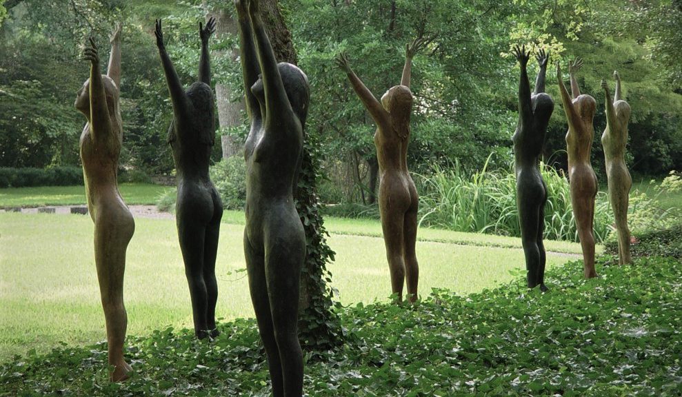
I have been an art dealer now for over 45 years who has been privileged to live and work in a 4-acre sculpture garden, envisioned by my parents, Donald and Margaret Vogel in 1959. As most of the artwork in the garden is consigned by artists and is for sale, it changes with some regularity. As new work arrives decisions must be made as to each sculpture’s siting, presentation, and other important considerations. To share some ideas about what I have discovered about this subject, I have written two posts. The first is titled: Siting Sculpture, Part One: Overview.
Entrance to the Valley House Gallery Sculpture Garden
The garden is modern and informal with winding paths, a large pond, and is normally accessible to the public when the gallery is open. Exhibitions of sculpture in the gallery often extend out into the garden. Although for sale, sculptures in the garden are not labeled or priced, and are intentionally installed to look like they were placed permanently.
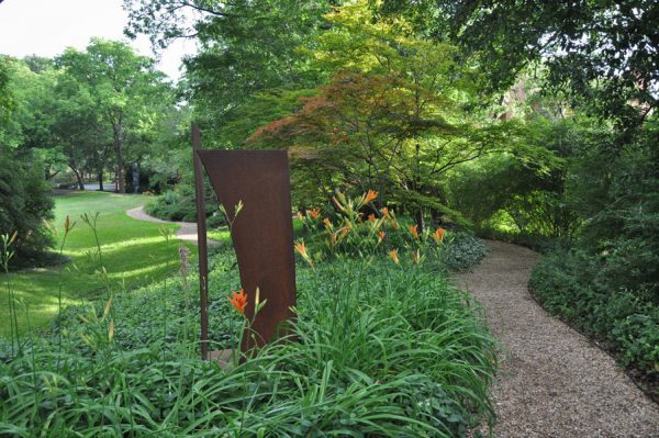
Sculpture in ground cover or flower beds requires less maintenance than sculpture surrounded by grass that must be mowed and edged regularly.
I am betting that for your residential clients you are rarely asked to help with sculpture placement indoors, and almost never outdoors. Unless it is already owned, sculpture is not normally thought of until all the two-dimensional works have been placed on the walls of a home or office.
Among other posts, I will be writing a series of articles related to sculpture placement both inside and outside the home and office, covering tips and ideas that might be useful to you when helping your clients place sculpture. Although some issues are unique to location, many considerations are the same and can be applied accordingly. Below are a few of the things to consider when placing sculpture.
Accessibility:
After determining a likely location for a sculpture, look for any unacceptable physical barriers or impeded sight-lines that obstruct access to the artwork.
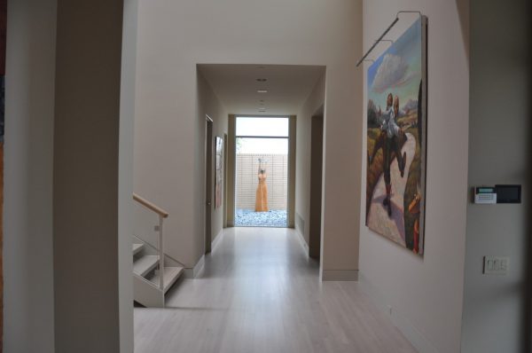
This sculpture is used as a focal point at the end of a long hallway. It is placed outside the home in front of a brick wall and framed by a large picture window at the hallway’s end. Although its placement does not allow the work to be viewed from any other angle but the front, it is given an exceptionally prominent spot where it can be viewed by anyone moving about the first floor of the home.
Siting:
This category encompasses the sculptures physical placement in a space and how it relates to everything around it.
Lighting:
This category involves every aspect of how the sculpture is either mechanically and/or naturally lit, 24/7.
Surroundings:
After determining a likely location for a sculpture, this category involves considering everything around the sculpture, both physical and visual, and how it might affect all the other categories now and in the future.
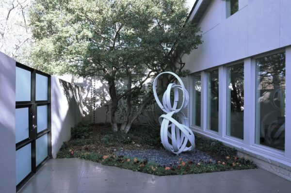
This sculpture is in the front privacy courtyard and is protected from view by a privacy wall and entrance gate. It can not only be seen by every visitor as they come and go, but also from the windows of the living room and the master bath bathtub window seen at the far back. It very nicely serves as a foil to the linear aspects of the rest of the entrance.
Security:
After determining a probable location for a sculpture, what is the perceived risk it will be stolen, vandalized, or toppled over by some force of nature?
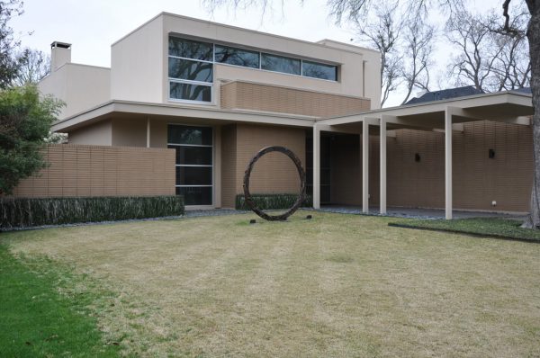
Although I am a big fan of people sharing their art by placing it in their front yards where everyone passing by can see it, today, this work is an open invitation for people to climb inside to mimic Leonardo da Vinci’s “Vitruvian Man” for an Instagram posting. There are lighting, maintenance, and liability issues with this installation I will explore in another post.
Safety:
After determining a probable location for a sculpture, is there anything about its location or stability that could cause harm to someone?
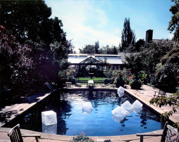
Although these plastic ice cubes floating in a swimming pool is a wonderful novel idea for a wild party, as a long term installation, it is a nightmare.
Maintenance:
After determining a probable location for a sculpture, beyond what would normally be needed to maintain the sculpture in general, it is important to determine if there are any additional maintenance issues created by siting the work in that location.
Disaster:
For any location a sculpture is sited, it is wise to take a moment and think about the area and what types of geophysical or weather related worse-case scenarios might affect the sculpture. If there is a potential problem, planning ahead for an event can minimize possible damage if one is forewarned.
Environmental:
For any location a sculpture is sited, are there any environmental issues such as direct sunlight, excessive moisture, extreme variations in temperature, or acid rain that needs to be considered?
In this series of articles, each of the above topics will be addressed regarding the proper placement of sculpture in both indoor and outdoor settings. I hope that forwarding my experiences with all types of sculpture installation will help you to more easily handle the issues faced when a design client wants to add sculpture to their art collection.
I am always available to discuss questions that may arise with sculpture placement. Just send an email with images attached of the sculpture and where you would like to place the work along with your phone number and I will get back to you as soon as I can. I may not always have a solution, but I bet I will be able to help you ask good questions.
Back when our gallery had a frame shop, the only option to reduce reflection on artworks that needed glazing was to ask for Non-Glare glass. Although this was a poor solution, it was the only solution at the time. Non-Glare glass had one side sandblasted so any reflected light would be dispersed, making the reflection look like a blob of light on the surface of the glass rather than returning a harsh reflection. We refused to use this glass because to actually see the artwork properly. You had to place the glass directly on the artwork, otherwise it would appear like you were looking at it through fog, and it is never a good idea to have glass sitting directly on an artwork in a frame assembly. (1.) So to understand what products are available today and how they work, and sometimes don’t, following are some reflections on the problem of reflections as they relate to glazed artworks.
Today, the best way to handle the problem of reflection is to use a glazing material onto which an AR (anti-reflective) coating has been applied. This is a similar coating that is now used on eye glass lenses that allows you to actually see a person’s eyes and it all but eliminates glare from oncoming car headlights at night.
The AR coating is designed to disrupt the energy contained in light waves causing them to flow out of sync. Under most conditions, AR glass helps reduce reflections to the point that they are not much of a problem, but it does not eliminate all reflection issues. From my personal experience, the coating’s effectiveness is related to how well lit the artwork is and the direction of the light source.
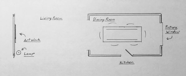
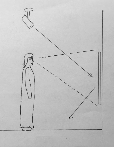
Diagram of rooms described below. Primary reflection problem was solved by changing glazing material to AR coated glass, turning on the living room lights, and the lamp beside the artwork.
This became evident to me when a client said she had a problem with reflection on an artwork in her living room. I suggested using AR coated glass thinking that that would most likely solve her reflection problem. I had the glass switched out and she called to let me know that the glass was still acting like a mirror. When I arrived to see what the problem might be, I discovered that, to my surprise, the artwork’s AR coated glass presented the exact same problem with reflection that the uncoated glass did. I noticed the room where the artwork was hanging and the dining room, across from the artwork, were both kept dark. At the opposite end of the dining room was a large picture window that was allowing a lot of light into the dining room. There was a door between the kitchen and the dining room she frequently used and as she walked through the two dark rooms, all she saw when she looked at the artwork was the reflection of the picture window at the far end of the dining room. I suggested that we turn on a lamp next to the artwork and discovered that the reflection issue was greatly reduced.
The takeaway of this story is that if an artwork has AR glazing and is well lit compared to its surrounding area, most reflection sources will be minimized and may not be noticed at all, especially if a viewer is focused on the artwork itself and not on the reflection source. In fact, I have often looked at artworks that have AR glazing and wondered why they weren’t glazed, only to discover on close examination that they were. If an artwork is underlit compared to its surrounding area and there is a lot of reflection, don’t be disappointed, it is just how the AR coating works. The solution is to either put more light on the artwork or reduce the amount of light in the surrounding area compared to what is already on the artwork.
Light source and highly reflective areas will be visible in the glazing if the artwork itself is not properly lighted.
Overhead lighting also helps to reduce reflections compared to lighting with lamps that are at the same height as the viewer. If you are standing beside an AR glazed artwork and there is a lamp on the opposite side of the artwork at the same angle and distance away from the artwork you are, you will see the lamp reflected in its glazing. With overhead lighting, the viewer would have to be looking up from the floor to see the reflection of the light above. AR glazing does have its limitations, but considering its old alternative, Non-Glare, it is a panacea.
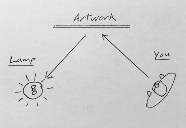
Reflection is all about the light sources surrounding a glazed artwork and their relation to the viewer. The best lighting method for glazed works on paper is from above unless an artwork is hung high on a wall.
As I mentioned in our last blogpost, When to use UV control glazing, the folks at Tru Vue have a good helpdesk and their technical department can answer most any glazing related framing or installation question. Their help desk number is 708-854-2700 and their email is [email protected].
I know of no circumstance where it is good for a glazing material to be in contact with an artwork on paper. If there is no other framing choice than to have the glazing material in contact with the artwork, it is better to use Plexiglas rather than glass. Quick changes in temperature and humidity can cause glass to fog over, even on the inside of a frame assembly. If this happens with a work on paper, especially if the glass is in contact with the artwork, the paper can absorb the moisture creating a perfect environment for mold to grow, the paper to be stained, pigments to react adversely, or wrinkling; none of which are going to be good for the artwork.
Have you ever had a framer tell you that you can protect a work on paper from fading just by putting UV (Ultraviolet) protective glass or Plexiglas on the artwork? Even though your framer is normally the one that suggests when to use UV control glazing, what they tell you may be truthful without being accurate regarding its effectiveness in your situation. So, here are some suggestions on when to use uv control glazing to prevent artwork fading.
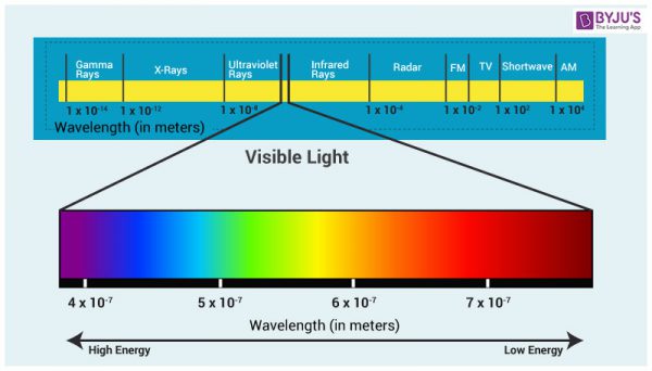
What your framer should have said is that depending on where a work on paper is hung, UV protective glass and Plexiglass can help protect it from fading. Ultraviolet light is the most damaging part of the light spectrum to fugitive pigments on paper and other materials that are prone to fading, like fabrics and furniture. High end UV protective glazing material is rated to block up to 99% of the Ultraviolet rays hitting an artwork’s surface. Just remember that UV may be the worst part of the spectrum, but it is only a small part of the spectrum that can cause damage. A greater issue is the overall amount of visible light that is hitting the artwork and the amount of time it is getting hit. Think of it as slow or fast fading.
• Little light over an extended period of time = slow fading
• A lot of light over a short time = fast fading
Ultraviolet light, the most damaging part of the light spectrum to works on paper, is in the sweet spot between visible light and x-rays. This means that UV is in the part of the spectrum that is higher energy than visible light but the rays do not go through the artwork like x-rays will. The UV rays penetrate the surface and are absorbed by the paper like a sunburn on skin. Because UV light is not visible to humans, removing it from the spectrum by using UV control glazing does not have much effect on the fidelity of an artwork.
If a work on paper was to be hung in a lightless closet, with properly controlled temperature and humidity that is never opened, it does not matter if it has UV protective glazing or not as it will not fade, at least not from light exposure.
If a work on paper is hung in a bright living room with big curtain-less picture windows looking out over a lake that reflects light into the room, even with UV glazing and protective windows the artwork will fade over time and the paper will darken. In the trade, when referring to the darkening of paper by excessive light, an art dealer would say that the artwork has been “light struck.”
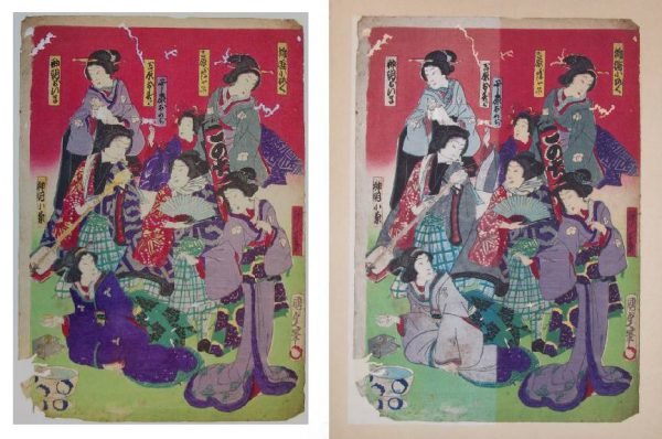
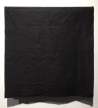
Left image is unfaded and right image is a composite image showing faded work on the left side and unfaded work on the right.
For most light sensitive materials, light damage is cumulative and irreversible. So, what are the best ways of minimizing the effects of light damage to an artwork on paper?
Museums have different regiments they follow regarding the amount of light exposure each work on paper can have. Each work is normally evaluated to determine how sensitive it is. It is then assigned an allowable exposure schedule, amount of time it can be on view, and a maximum allowable light level for the duration of that time. For example, a sturdy work might be allowed to be on exhibit for 4 months at a specific light level and then rest for two years, or for 6 months at that light level and rest for three years. A more fragile work may require lower light and less time on view.
Don’t Panic! The Museum protocol I have just described is designed to meet the museum’s charge to protect what they have collected or are exhibiting. Your clients want something they can hang on the wall and enjoy for the next 20 years. So, to accomplish this goal I suggest the following:
• For works on paper that you or your client consider valuable and want to last as long as possible, definitely use UV protective glazing as it greatly reduces the most damaging aspect of the light spectrum.
• Hang in rooms with minimal light during the day like hallways or bedrooms that are not in continuous use and are normally kept dark.
• Keep lights off when rooms are not in use.
• If an artwork is hung in a room that has windows that allow a lot of light into the room during the day, add blackout curtains to the window that can be closed when no one is using the room. Codes for new buildings in most areas require that windows block a lot of the light coming in for reasons of energy conservation. This can greatly extend the life of curtains, rugs, and furniture as well as the art by reducing the amount and intensity of light entering a room and therefore slow fading.
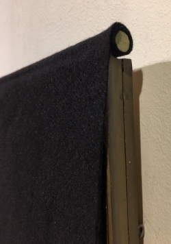
• Have blackout fabric covers made for the artwork in rooms that window curtains are not an option or skylights let light in that cannot be blocked. They can incorporate a weighted rod at the top that can be draped over the top of the frame with the fabric hanging over the front of the artwork. This will allow quick access to works when you want to view them and they can remain hung indefinably without overexposure to light.
• Keep these works out of often used bedroom bathrooms and kitchens. These rooms often are subject to high humidity and temperatures, and other issues with that I will address in a future post. They are also rooms that would normally be well lit and where you would not normally want artwork that needs protective covers to keep them from fading.
• Place UV tube covers over your fluorescent lights. Of the three main light sources in homes and offices used today – Fluorescent, Incandescent, and LED – Florescent light, for the same amount of lumens output, is the most damaging because it produces the most UV light.
• If LED lights are producing the same number of lumens as your incandescent bulbs do, they are causing an equal level of fading to your works on paper.
One of the main manufacturers of conservation-grade UV protection glazing is Tru Vue. They have an excellent highly informed and well-educated customer support staff. If you need clarification, again no pun intended, as to whether UV protective glass and Plexi will work in a specific application, give them a call.
Tru Vue help line: Phone: 708-854-2700
Email: [email protected]
Note: Not that it is my field but I was informed by the folks at Tru Vue that one of the most frequent calls they get is from signature collectors who have used their products and have had their valuable signatures fade from being out on display in rooms that have too much light. Their glass was doing what it was supposed to but many framers are often not aware that UV glass alone will not stop fading, it only helps to slow it down. The recommendations I have made above should help with this issue. Another interesting thing they said is that often, ink signatures seem to fade very quickly to a certain point and then the fading process seems to slow. So the maximum amount of damage happens in the earliest part of their exposure.
One of the most common questions asked by new clients when they purchase a find print from me is “What does that fraction mean on a fine print?” They are referring to the fraction, often written in pencil, most commonly found at the lower-left bottom edge of the image or platemark. I have written three short essays to hopefully bring a little clarity to the subject. I have also provided a link to a glossary of terms related to the editioning of fine prints.
Part 1:
An overview of the things that you may find helpful to know regarding the modern editioning for fine prints and what the fraction, found in the margin under the image, actually refers to.
Part 2 :
A short case study regarding the editioning of a series of old master prints by Albrecht Dürer (German, 1471 – 1528) called the Apocalypse.
Part 3:
An overview of what I found when I was trying to determine what fine print publisher or which artist was the first to use a fraction to describe the print number and the edition size that is now the universal format. I cannot say I found the first, but I did find an 1895 reference point that will be a benchmark to beat in the future.
Part 4:
A link to a glossary of terms related to types of proofs and related nomenclature. You are welcome to download this Word file and keep it as a reference.
Note: In conveying the information below, you will see that I have qualified almost every example I have used related to editions or a fraction’s numerator and denominator. This is because in every case described below, in the 40+ years I have been dealing with fine prints I have personally run across exceptions, but they are rare.
Part 1: Numbering and Edition Overview:
After a number of prints have been produced by or for an artist, it is a standard practice to use a fraction to identify both an individual print and the number of like prints the artist has declared that will then constitute an “edition.” With few exceptions, this fraction is written in pencil beneath a print’s image at the lower left or lower center margin by either the artist or the publisher. There are several misconceptions as to what the numerator and denominator of this fraction mean related to the edition of fine prints and I hope the following information is helpful when looking for fine prints for your clients.
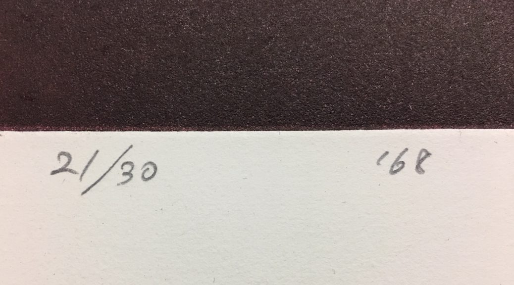
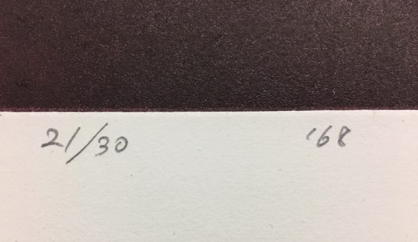
Fractional edition number with date. This is the print designated as number 21 in an edition of 30.
The Numerator:
Because written definitions of what the numerator represents are often imprecise and ambiguous, they can easily lead someone to erroneously believe that the numerator indicates the sequence in which the prints of that edition were printed. (i.e. if the fraction written on an etching is 5/25, this would indicate that this print was the 5th print pulled off the plate in a total edition of 25.) In truth, this number does not relate to the print’s printing sequence but is only a cataloguing device, a way of identifying print 1 from print 2, etc. The odds of this print being the 5th one pulled from the plate is, for various reasons, more than 1 in 25.
It is most often the case that the earliest prints off a plate, stone, or block, depending on the technique used, are often considered by collectors and curators to be better and therefore more desirable impressions than those printed later. This is due to the wear and tear on the matrix from repetitive printing. What is almost in all cases not true is that the numerator of the fraction can tell you if a print was an early impression or not; only its superior quality compared to other impressions of the same print can do that.
The Denominator:
The Denominator of the fraction relates to the total size of the artist’s declared edition of like prints. The term “like” prints is important here as it means that the only thing that is different about each print when the edition is finalized is the numerator of the fraction. Everything else, the paper type and size, the inking of the matrix, and the way it is numbered and signed are all the same. It is important to remember that the denominator just indicates the size of the allowable edition, it in no way substantiates that editioning was completed after its size was declared. It is often only the print documentation from the press that produced it, the artists print log, or a well-researched catalogue raisonné that can enlighten one as to how many prints were actually printed of an edition.
It was popular, in the case of well-known artists like Joan Miró, to have their press print multiple editions from the same plate or stone. For instance, Miró would sometimes authorize a second edition on a different type of paper. So, you might see a print by Miró on Arches paper in an edition of 250 in one place and the same print on Japan paper in an edition of 100 somewhere else. Miró would sometimes authorize a special small edition of a print to be published that was in every way like another edition except that instead of numbering the edition in Arabic Numerals, it would instead be numbered with Roman Numerals. The takeaway here is that there may be more than one edition of a print. This usually does not occur unless the artist’s market is big enough to absorb multiple editions.
With most any known declared edition, there are additional like prints called “prints outside of the edition.” Conventionally, beyond the edition defined by the denominator, a certain number of prints will be printed that will be designated as Artist Proofs. They are like the edition in most every way except rather than being numbered with a fraction, the letters “A.P.,” (épreuve d’artiste in French) or a variation thereof, are written instead. The number of A.P.’s varies with how many the artist wants to have printed but it is rare that they exceed more than 10% of the total edition size of like prints.
Again, in the case of Miró and other printmakers who were well known in the latter part of the last century, another type of print designation was used initially in Europe to boost the number of prints outside of an edition. On occasion you will see prints, instead of being inscribed A.P., inscribed “H.C.,” (Hors de Commerce) or a variant, that means amusingly “not for sale.” Prints with this designation can be found occasionally on the market but they were originally intended to be gifted and not sold commercially.
There are other print edition designations that I will not go into here as the chances of running into them while looking for art for your clients is unlikely. Below is a quick history of editions as they relate to old master prints and to the earliest usages of the fraction to indicate edition size. If you find that you have a question about something on a print that you don’t understand, send us an email with an image and we will get right back to you.
Part 2: Old Master Prints:
Dürer’s “Apocalypse” 1511 title page
Albrecht Dürer (German, 1471 – 1528) was one of the world’s most famous and important printmakers. He produced a series of fifteen large woodblock prints based on, and called, Apocalipsis cum Figuris, known today as the Apocalypse. Outside of proofs printed to test the image and those that were printed to sell or gift, in 1498 the fifteen prints that made up the series were printed with text, some in Latin and some in German on the verso of each image, and bound. Prints that appear on the market today from this edition of books are described as “from the 1498 edition.” This series brought Dürer great fame and notoriety. Because of the popularity of the series, it can be assumed that he continued to print individual proofs from the blocks until he published another bound edition of the Apocalypse in 1511. After that series, where individual prints are now known as “from the 1511 edition,” the woodblocks were printed as the market demanded until they had worn down to the point that they could no longer produce acceptable prints.
Dürer’s woodcut The four horsemen of the Apocalypse
Before Dürer’s time and well into the 19th century, the number of prints off a plate, stone, or wooden block was determined by either demand or the condition of the matrix used that allowed acceptable prints to be created. Today, we would call that an “open edition” because the edition size was not declared by the artist. In the case of Dürer’s Apocalypse, there are two actual editions from the same woodblock of each of the 15 Apocalypse prints and many prints outside of a known edition. When dealing with old master and 19th century prints, date of printing, quality of impression, condition, and notoriety of the image are directly related to the print’s value. In the case of these specific Dürer images, as well as many other old master prints, editions and other proofs can often be dated by the paper it was printed on and the watermark it may bear.
Part 3: When the Numbering of Fine Prints Became Popular…
Most likely inspired by the rare book trade, consensus leans toward the idea that it was the fine print publishers in 1890’s France that started numbering the prints of the editions they published. One of the best known and most important printmakers during that time in Paris was Toulouse Lautrec who was a prodigiously active Lithographer from 1891 to 1900. By using the catalogue raisonné Toulouse-Lautrec: The Complete Prints by Wolfgang Wittrock as a reference, a window is opened into the innovations and practices regarding print numbering and editioning during this period. Here are my takeaways:
• Lautrec signed a small number of his prints but although many of his prints are numbered, it is believed that he did not do this himself; they were most likely numbered by the publisher. In many cases, just under half or just over half of the prints were numbered. The number system most often looked like “No: X” and written in pen or pencil. In some cases, stamps were used to number the prints. It is not clear why only half of an edition was numbered as it creates a very ineffective inventory system. *1
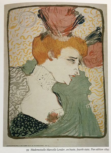
Lautrec’s “Mademoiselle Marcelle Lender” color lithograph
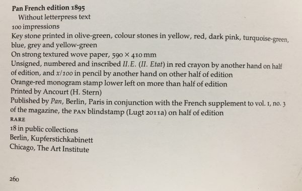
• The states (prints that show developmental changes) and edition sizes of most of Lautrec’s prints are known but the edition size was rarely indicated on an individual print. In reviewing all the print entries in Wittrock’s book, there are only five times that a fraction was used to indicate both the prints assigned number and the number of prints in the edition. The first time a fraction was used on a Lautrec print was 1895 on half of the Pan French Edition of 100 prints of Mademoiselle Marcelle Lender, en buste, (Wittrock 99.)
Wittrock’s entry for the Pan French edition of Lautrec’s “Mademoiselle Marcelle Lender” color lithograph
*1 – Today, fine art presses will often publish artists’ prints by offering them studio space, possibly room and board while they are working, and then printing an edition of what the artist produces in exchange for a percentage of the edition. This way a press will have an inventory of prints by artists they respect, and the artist keeps the rest of the edition. It is known that most all of Lautrec’s prints were sponsored by the publisher and very few print editions were paid for by him. This may account for the fact that often, only about half of his prints’ editions were numbered by the press.
Part 4: A Glossary of Terms Related to Types of Proofs and Related Nomenclature
Back in 1989, a colleague named Frederick McElroy, who had a masters in printmaking, and I decided that we would create an exhibition that focused on both the connoisseurship and technical aspects of Intaglio printmaking. One of the dealers we work with in Austin Texas who owns Flatbed Press suggested that this glossary would be a good addendum to the article above.
You are welcome to download the glossary as a word file by clicking Here. You are welcome to print yourself a copy for reference if you like but if you quote any of these entries in a publication, please credit Fredrick W. McElroy and cite the exhibition catalog Connoisseurship and the Intaglio Print, 1989.
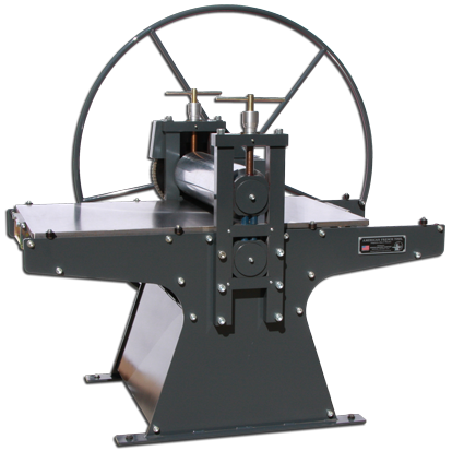
It is fairly easy to differentiate between how a fine print, a limited edition print, and a giclée print are produced. What is difficult, in today’s art world, is to make a call as to which should be more valued and why.
So, instead of making outright pronouncements, I will suggest some, as was explained in the Pirates of the Caribbean, “guidelines” to use in thinking about issues of intrinsic value as they relate.
Fine Print
In the creation of a Fine Print, depending on the medium, an artist works on a metal plate, stone, woodblock, cuts a stencil or alters some other material to create a matrix (design). When ink or other pigmented material is applied in, onto, or through the matrix and then the image is mechanically transferred to a piece of, in most cases paper, a fine print is produced. In a fine print, the paper with the transferred image is the artwork, not an exacting copy or reproduction of something else. I certainly include photography as a fine print medium as it is historically produced through a captured matrix and manipulated to the artist’s specifications through the printing process.
The classic categories of print processes used to create fine prints are:
Historically, these were the processes by which artists were able to provide original works of art in a more democratic and less expensive manner to a larger audience than with paintings or drawings. Because each matrix is inked and mechanically printed by hand, one at a time, each print is unique. The artist may decide to produce one unique proof from the matrix or as many prints as the matrix allows. Fine Prints have always been of interest to collectors. If an artist becomes better known over time and their art appreciates because of collector interest, chances are their fine prints will follow suit.
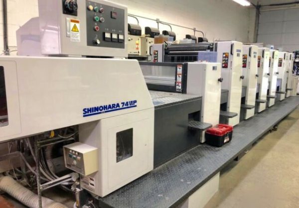
Limited Edition Prints
From the 1960’s and well into the 1990’s artists discovered that they could produce a painting, watercolor, or drawing, and have it reproduced by an offset four-color printing press in large numbers to whatever size the press was capable of. Most of the editions created this way were large because of the initial set up costs but the price per print came down with every print produced. Editions were sometimes as low as 500 but most were between 1000 and 2000. An edition of 2000 would cost the artist around $2.00 a print. If they wholesaled a print at $10.00 to $20.00 dollars to a frame shop and the frame shop sold it to a client for between $40 and $100 and frame it for $150, they would walk away with a tidy profit. The artist would often sign and number each print to generate perceived value.
Four-Color Offset Printing Press
Most successful artists, those represented by higher end art galleries and having works acquired by museums, did not produce four-color offset limited edition reproductions of their artwork, but this type of print did provided a good income and exposure for many talented artists who did not achieve critical success with their original art. Other than the value of enjoying an image you like on the wall, the resale market for limited edition prints of this type is most likely through garage and estate sales, or eBay, and their selling price will rarely exceed their original purchase price.
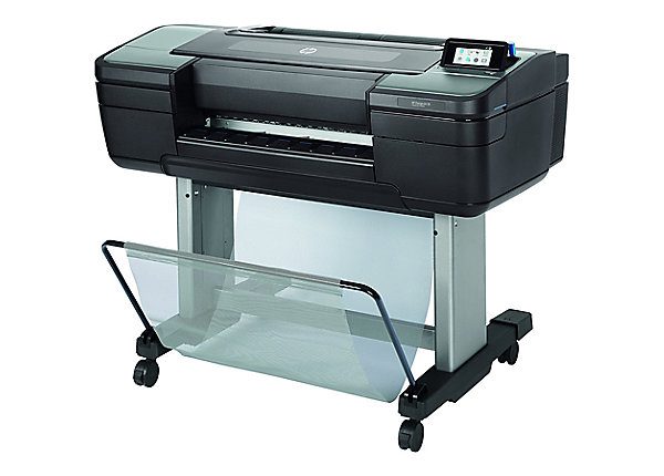
Giclée Prints
As printing technology moved on, in the 1990’s, the ink jet printer attached to a computer provided a new way that artists could produce limited edition prints. The term Giclée was coined for high quality ink jet prints by Jack Duganne. Duganne worked for Graham Nash, of Crosby, Stills, and Nash fame, and Mac Holbert, the band’s road manager, who together started the fine art printing business, Nash Editions, LTD in Nash’s Manhattan Beach, California carriage house.
The term stuck and today, although technology has improved the giclée inkjet print to an exceptionally high level of fidelity and color quality, it is still used by many artists to make very high quality reproductive limited edition prints. Because of these attributes some artists, especially photographers, are now using inkjet printers exclusively to print their editions. Since these artists consider their inkjet prints to be the finished work of art, to distinguish their artworks from a giclée reproductions, some are calling their artworks’ medium “archival pigment prints.”
HP Large Format Inkjet Printer
In inkjet printing, a specific black or colored ink is blown onto the surface of a piece of paper in small droplets. Their number and juxtaposition to other colored ink droplets determine the final color of each pixel that makes up an image. Because of the incredibly small size of each pigment dot, there is no determinable dot pattern that is the hallmark of offset four-color printing.
Although individual inkjet prints are more expensive to produce in large editions than on a four-color offset press, they have many advantages:
Inkjet color printers can work with as little as three ink colors but high-end printers can incorporate many more colored inks that allow more nuanced color and a thicker pigment density than four-color offset printing.
Higher quality papers can be used in inkjet printing than in four-color offset.
Because they are printed slowly one at a time, after they are proofed and ready to edition, inkjet prints are much cheaper to produce in a small edition. An edition of 2,000 might take an hour on a high speed four-color press but an edition of 1000 inkjet prints of the same size would take days on a high-end inkjet printer.
For me personally, artwork in its conceived state has intrinsic value. When an artwork’s medium is changed so it can be duplicated in large numbers for reasons of commerce, I am less interested in the copy, no matter how beautiful it may be in its reproduced state. Limited edition prints and reproductive giclée’s are certainly a blessing for those who cannot afford original art or are not interested in an artwork’s material or aesthetic aspects. They allow one to enjoy an image and fill a space where an artwork is needed. I have no doubt that there are many who would receive as much pleasure from a reproduction as I would get from an original.
I will caution anyone who buys a reproductive giclée or limited edition print thinking that it will turn out to be a good long term financial investment. The odds of this happening are not in their favor. Purchase only because you like the work or it fits your purpose at the time. The true investment in art is the privilege of living with it.
THE MOST DEMOCRATIC & TRANSPARENT WAY TO BUY & SELL ART THERE IS…
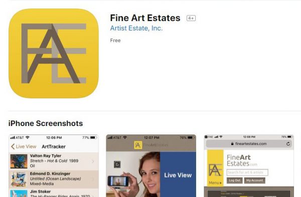
My name is Kevin Vogel, founder of Artist Estate, Inc. and owner of the e-commerce website FineArtEstates.com (FAE). I come from a family of art dealers. My parents, Margaret and Donald Vogel started Valley House Gallery in North Dallas in 1954, making it the oldest continuously operating modern art gallery in Texas. It is uniquely situated on 4.3 acres of beautifully landscaped sculpture garden that is open to the public during gallery hours. I have been working with the gallery since 1974 and Cheryl and I have been running it for well over 30 years. The gallery originally handled Impressionist, Post-Impressionist, Modern, and Contemporary art. Recently, our interests have focused on the Contemporary and late 20th Century.
About 5 years ago, a dear friend of our family and an artist, passed away in California. She had been moderately successful over her career but left a very large estate of artwork. Her husband called me several weeks after she had passed and asked the question; “How do I sell all of this art?” Even though I had been dealing with art and artists for over 35 years at the time, and had represented and promoted artist estates, I realized that I did not have a good answer for our friend.
Artists, whose reputations warrant a foundation looking after their art, or who have a gallery representing their estate, are the lucky ones. Most do not have a Dealer to strategically promote and place their artwork through direct sales and/or by auction and those who do are dependent on the performance and honesty of the agents involved. No matter how good or well-intentioned a Dealer or auction house might be, the one missing element in both (because of their inherent business structures) is transparency.
With few exceptions, artists, estate attorneys, trust officers, or those with the fiduciary responsibly of overseeing an estate of artwork are woefully unprepared to deal with art-related estate issues on their own. For many reasons, an artist’s intellectual property often ends up in long term storage where it instantly becomes a depleting asset.
By observing and being a part of these processes myself for over 40 years, I am keenly aware of most of the issues artists and collectors face. So, I decided to devise a solution that would provide both with a way to thoughtfully monetize their artistic assets in a timely manner, while providing all involved a maximum level of transparency. An ecommerce site seemed the most logical solution.
Conceptually, I wanted the site to:
Remedy the problems inherent in most other ways of selling art, on- or offline
Make the process as turn-key as possible for the artist, collector, or their heirs
Provide every consigner 24/7 access to status information about their artwork
Make the transition process to an estate representative as seamless as possible
Archive all biographic information and images of sold works as an ongoing historical resource
Devise a system of selling that is democratic, and that practically guarantees each work of art will sell
Provide Buyers with tools that will make finding, tracking, and acquiring art simple
Provide professionals with special tools to create multiple “Projects” that facilitate their ability to service their clients’ fine art needs
Create a system of alerts that will provide each buyer timely artwork-specific information
Allow a search to be saved, re-run on a schedule, and alert a Buyer when new works that meet the search criteria have been added to the site
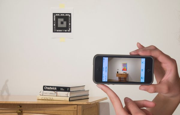
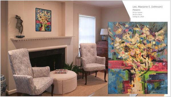
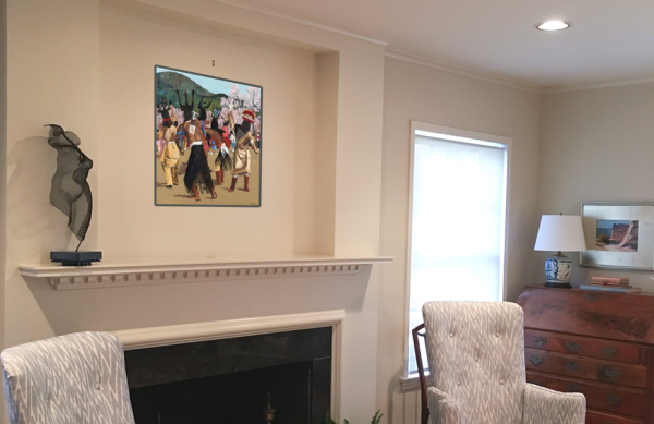
Provide a system for a Buyer to virtually see what an artwork will look like in their space
Provide everyone involved the highest level of transparency possible
With the help, guidance and support of a great many people, the FAE team has developed what I believe to be the most democratic and transparent way of selling fine art devised so far; meeting or exceeding each of the goals we set out to achieve when creating FAE.
Personally, the 5 years I’ve spent working on this project have been the most challenging and exciting I have had as a dealer in fine art. The FAE project has created a safe and transparent conduit for artists to monetize their artistic assets while protecting and preserving their artistic legacy. It has also provided the collector with an unequalled level of transparency and comfort in knowing their collection will sell for its true market value.

 Practical Tips for Safely Transporting Artwork
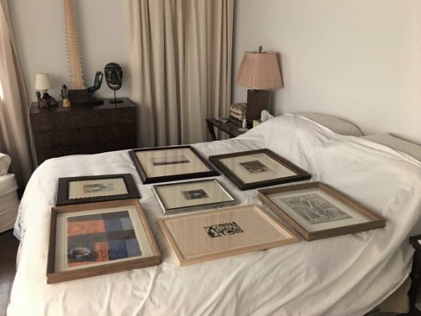 Temporarily Storing Artwork: A Case Study
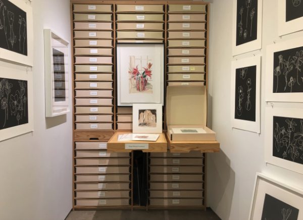 Four Artwork Storage Solutions
 Hanging and Framing FAQ’s
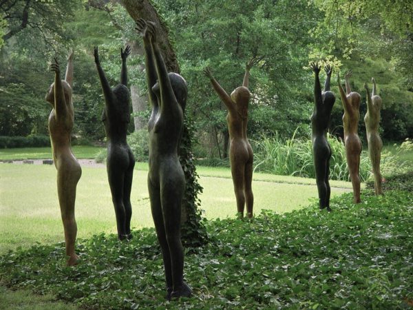 Siting Sculpture, Part One: Overview
 The Importance of a Proper Frame
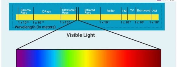 When to Use UV Control Glazing
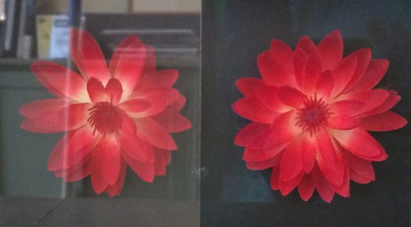 Reflection on the Problem of Reflections
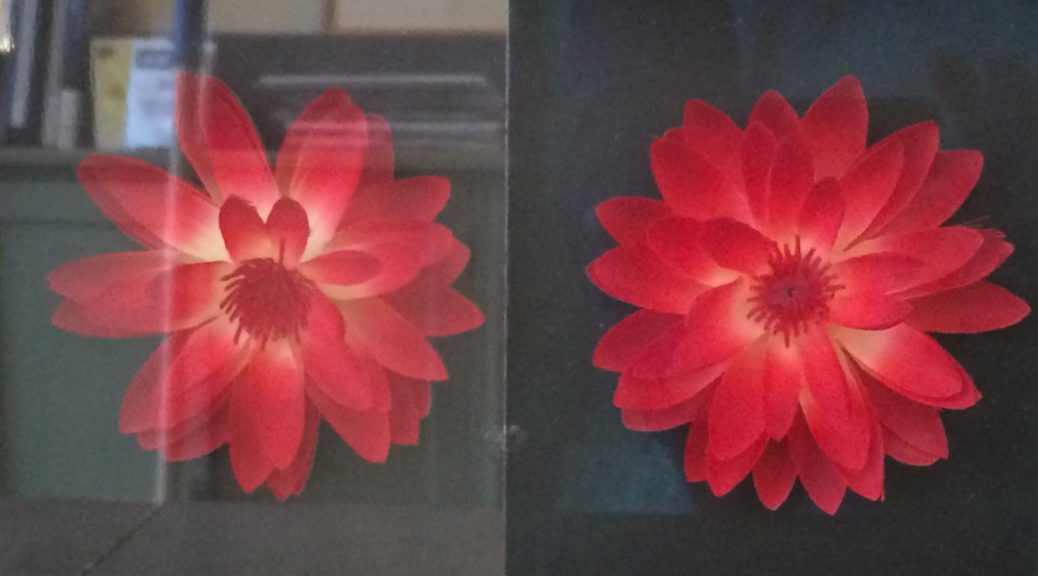

 window curtains are not an option or skylights let light in that cannot be blocked. They can incorporate a weighted rod at the top that can be draped over the top of the frame with the fabric hanging over the front of the artwork. This will allow quick access to works when you want to view them and they can remain hung indefinably without overexposure to light.


 been working with the gallery since 1974 and Cheryl and I have been running it for well over 30 years. The gallery originally handled Impressionist, Post-Impressionist, Modern, and Contemporary art. Recently, our interests have focused on the Contemporary and late 20th Century.