Artworks are often at their most vulnerable when they are in transit, especially if the person who is transporting them is inexperienced. So to ease the stress and anxiety of doing so, I though I would share some practical tips for safely transporting artwork in your own vehicle.
For this post, I thought it would be helpful to offer some suggestions as to how to safely transport a single two-dimensional artwork in a personal vehicle. As most people do not have professional packing supplies at home, I will focus on using household items such as blankets, large garbage bags and pillows to be used sensibly in protecting the artwork when it is placed in the automobile.
All the suggestions I have made below come from over 45 years of experience in packing artwork in just about every type of vehicle, and from seeing how artworks have been delivered to us by non-professionals. Every situation is different and none of the suggestions I am making will protect the artwork or you in a serious accident. These suggestions are just “guidelines.”
Will it Fit?
It may sound rudimentary, but whether you are taking an artwork from home to another location or heading out to pick up a new acquisition from a gallery, it is always a good idea to measure the artwork and the space in your vehicle where you are planning on securing it, to see if it will comfortably fit. Also, where it will be placed in the vehicle, the type of artwork, and how it is framed will all determine if it needs to be wrapped, and if so, what level of protection is required. Once that is determined, take that overall packed size into account when measuring.
If you are picking up an artwork, say from a gallery, remember that if it is framed, the size of the artwork documented on the bill of sale or in the catalog of the show is the actual artwork size, not its overall framed size. Call the galley and ask them to measure the overall size of the artwork before driving across town to find out that it will not fit in your vehicle. Also, it’s not a bad idea to let the preparator of the gallery know where you are planning to place the artwork in your vehicle, and where, so they can pack it accordingly and then provide you with its overall packed size before you leave to pick it up.
Is it Safe?
Be sure to think about where the artwork is being placed in the vehicle and what will happen if you must maneuver quickly left or right, slam on the breaks, or worse, get hit by another vehicle. Is it packed and placed in the car in such a way that, if any of these things happen, you and others will be safe from its movement? Will the artwork sustain minimal damage because of how it is packed?
It is important to remove any loose objects from the space in which the artwork is to be placed for travel unless the object is being used as part of the bracing or packing process. We must often move tennis rackets, golf clubs, gym bags and other things from a client’s trunk or back seat before placing an artwork inside their vehicle.
It is best not to take a pet along with you when you transport art. If you must, be sure they are restrained or not able to get into the area where the artwork is placed. I have seen both cats and dogs happily prance across an unprotected canvas in the back of a vehicle. The attention you are paying to your driving will diminish greatly if “Fluffy” decides to take a walk across your newly purchased Monet waterlily painting while you are changing lanes on a freeway.
Preparing Artwork for Transport
I am assuming for this post that you are not planning to wrap the artwork with anything other a plastic trash bag. Most galleries are happy to wrap a work in bubble wrap or other appropriate material if they know you are coming. Most of the suggestions I offer here can be modified to take into account a wrapped work.
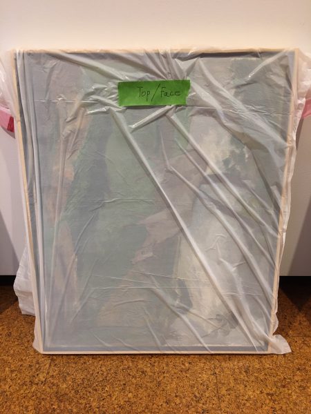
Be sure that if you wrap a framed and glazed artwork on paper in an opaque material so you are unable to tell which side of the artwork is up, that you mark it in some way to identify its face and top. A face drawn on the front of the package or a piece of painter’s tape with “TOP” written on it works well. Works on paper need to be carried with the hinges at the top so they do not tear or pull free because they were carried sideways. In the business, when a hinge pulls free separating the work on paper from where it was mounted, we say that the artwork “slipped its hinge.” A phrase every dealer hates to hear.
So, here are several common ways two-dimensional artworks are normally transported in a personal vehicle and my suggestions on the best way to protect them using household materials.
Transporting an Artwork in a Trunk
If your trunk is empty and your artwork comfortably fits; if your destination is not far and you are traveling without other stops; if it is not raining and the temperature is not too extreme; then the carpeted trunk of an automobile is the ideal place for an artwork to travel and you will probably not need to have it wrapped at all. Since it is separated from you and your passengers, it is also the safest way.
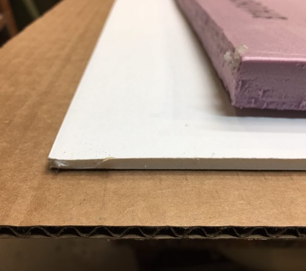
Unglazed Artwork:
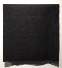
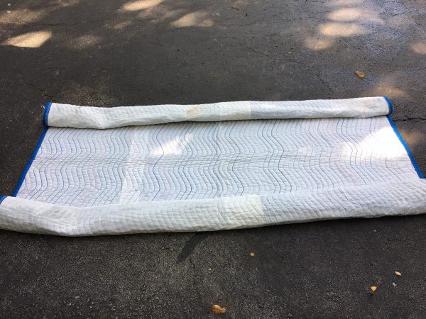
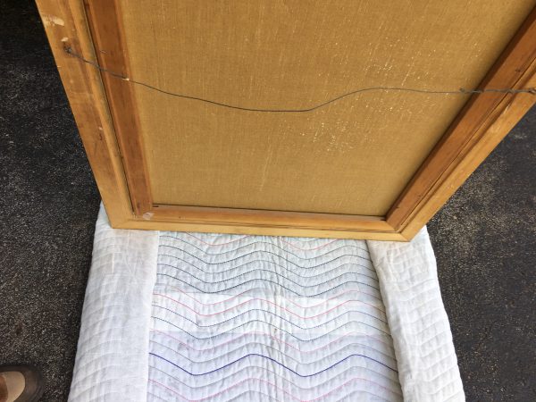
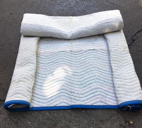
If the artwork is not glazed and does not fit snugly, place an open blanket on the bottom of the trunk so the area where the artwork will sit is completely flat. Place the artwork on top of the flat area of the blanket and roll under the outer edges of the blanket like a jelly roll so they form a barrier around the artwork as illustrated below. Make sure the furthest edge of the artwork is resting against the far end of the trunk, closest to the back seat. This will pad all the artwork’s sides and keep it from quickly sliding forward and banging into the back of the trunk during a quick stop. It is my recommendation to never place a blanket over an unglazed work, especially if the artwork’s support is stretched canvas.
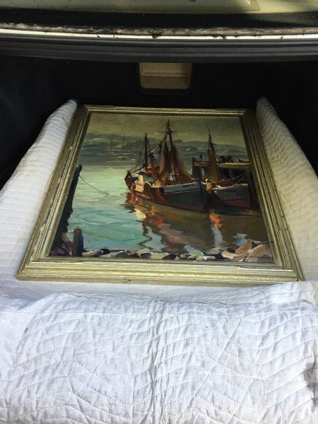
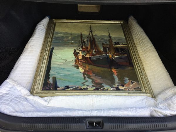
Note: About one in every three people who bring artworks to the gallery cover or wrap them in a blanket thinking they are protecting their artwork and its frame if it has one. This is not much of an issue if the artwork is glazed and the glazing is intact. However, if it is an old unglazed oil on stretched canvas that is starting to flake, laying a heavy blanket on it can cause expensive-to-repair damage. For instance, the weight of the blanket can push down on the canvas causing it to become concave and stressed. The act of placing a blanket on the work and taking it off can cause any dry impasto or already damaged areas to flake off. It can also break off partially secured areas of a fragile frame.
Glazed Artwork:
If the artwork is glazed with glass, a blanket can be place beneath and around the artwork as previously described. If more protection is needed, a soft blanket can also be laid over the artwork and folded around it. If an over blanket is used, remove it before picking up the artwork to be sure it is carried upright.
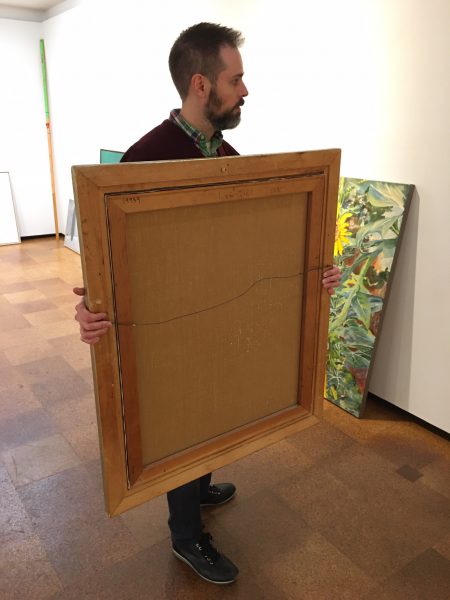
Note: Always carry an artwork upright facing you, holding it with two hands from both sides. It is not a good idea to carry it from the top of the frame, and it is best not to carry it around by its hanging wire if it has one. You are making a lot of assumptions by doing so and you have much less control over the artwork.
If the artwork is glazed with plexiglass and you believe it needs to be covered with a blanket for extra protection, put a plastic bag over it first followed by the blanket, wrapping it around the edges of the frame. This will prevent the plexiglass from being scratched by the blanket. If it is raining, you might want to place the artwork in the plastic bag making sure to identify the front and top of the artwork by marking it somehow before taking it to your vehicle.
Transporting an Artwork in the Back Seat.
Transporting artworks in the back seat area of an automobile is not optimal for many reasons but sometimes, because of an artwork’s size and the circumstances, it is all that’s available. So, if it is the only option, here are my recommendations to transport the artwork as safely as possible. When doing so, please drive like you have a baby in the back seat.
All automobiles are a little different. You can measure to determine that an artwork will fit in between the front and back seats, but there are other factors to consider, and one of them is the artwork’s depth. The back door at its fully open position, window down, may not allow an artwork of your measured size to fit past the back seat, and the drivetrain hump in the middle of the back seat floorboard may be an issue. Remember, the designers of your automobile’s back doors thought only about people’s ability to get in and out, they did not care, nor even think about, your need to transport artwork.
Again, be sure that the back seat and floorboards are clear of any loose objects. It is not a good idea to have a loose bowling ball sitting on the back seat behind an artwork.
Transporting a Small Artwork in the Back Seat Area
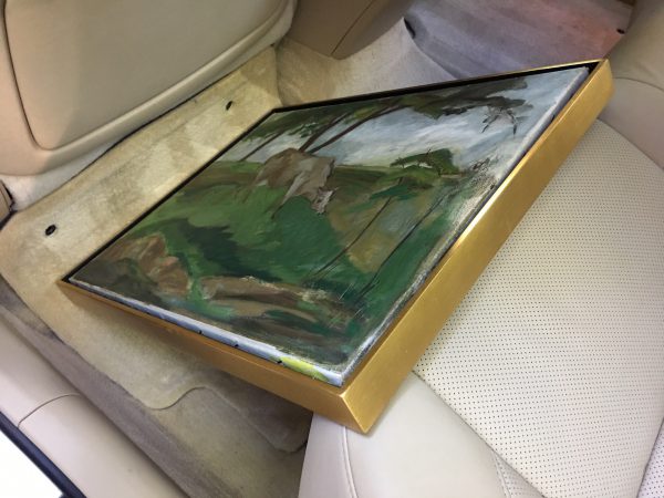
A small work is best placed on the floorboard facing forward on either side of the drivetrain hump if the vehicle has one. It should be placed at an angle where the bottom of the frame touches the front seat back, and the artwork’s top back side leans against the front of the back seat. To protect the bottom of the frame from any hard surfaces behind the front seat, something needs to be used as a buffer. If the car has floor mats, push the mat forward and curl it up to protect the bottom of the frame where it sits against the back of the front seat. If it doesn’t, a rolled towel will do the trick.
I recommend that smaller works not be placed on the back seat itself, either upright or flat, unless there is something between the front and back seats that will keep the work from falling to the floorboard in a sudden stop. If there is something there that is about the same height of the seat, like a soft gym bag, then a medium size artwork can be placed flat on the rear seat extending over the built-up space between the front and back seats.
Transporting a Medium Sized Artwork in the Back Seat Area
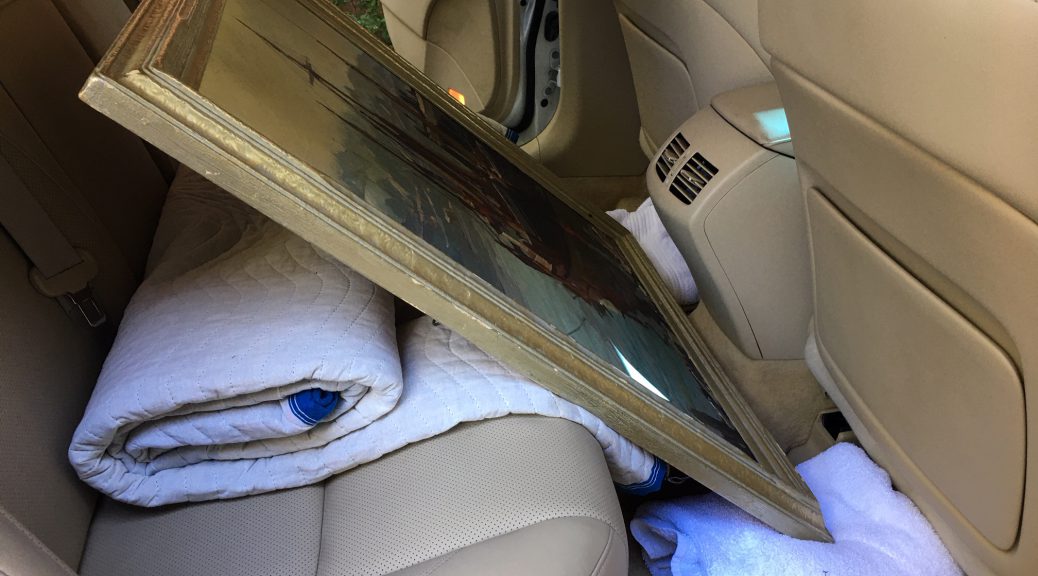
Most often, a larger work will need to be placed between the front and back seats, facing forward. After you know that the artwork will fit, there are four contact points that need to be considered. Also, if the artwork is a hinged work on paper in a vertical format, for reasons we discussed earlier, do not turn it sideways to get it to fit.
Contact Point One: The Front Edge of the Back Seat
Glazed works on paper are most often backed and therefore, a medium sized work on paper can ride with its back side against the back seat, so long as any exposed hardware will not potentially cause damage to your back seat upholstery. A blanket hanging over the glazed artwork can prevent this. (Remember to bag the piece if it is glazed with Plexiglas and mark its face and top before putting a blanket over it.)
A framed or unframed stretched canvas that does not have a backing may be at risk, depending on the design of your vehicle’s back seat. If the seat has a convex shape or has areas that protrude, it may push into the back of the canvas, stretching it out of shape. This is less likely if the canvas has a vertical stretcher brace down the middle that will rest against the seat, keeping the seat from touching the canvas. Without that brace, even if the artwork is packed in bubble wrap, it may be at greater risk from the convex back seat as it could push the bubble into the back of the canvas, placing even more pressure on it.
If no brace is present, there needs to be a flat support behind the artwork, or something else, protecting it from the front of the back seat. The support can be a piece or corrugated (fluted) cardboard, foam insulation, or other stiff material cut to the same size or a little larger than the overall artwork. If these materials are not available, a properly folded blanket can hold the artwork off the seat back to prevent damage to the canvas.
If no flat material is available, roll a blanket from two sides so the distance between the rolls matches the back of the stretcher and the artwork’s frame, and then hang the blanket over the edge of the back seat so it provides a buffer that will keep the canvas from touching the front edge of the back seat.
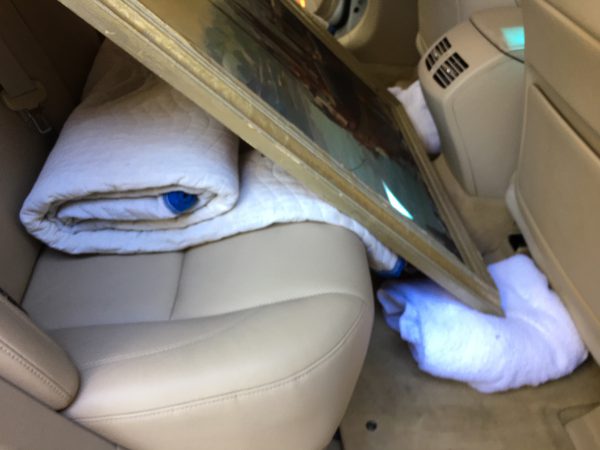
Contact Point Two: The Floorboard, the Drivetrain Hump, and the Console
The next thing to think about is where the bottom front edge of the artwork meets the bottom of the front seat or the back of the console that divides the two front seats. A floor mat, a rolled-up towel or a piece of clothing can act as a protective buffer to hold the artwork in place and protect it from any metal or hard plastic parts under the front seat or the back of the console. If the artwork is now balancing on the drivetrain hump, you can roll towels or two strips of bubble wrap and place them under each corner to keep the artwork from listing over one way or the other while driving.
Contact Point Three: Protecting the Front of the Artwork.
In a sudden stop or head-on accident, the entire artwork will try to move forward. If it is wrapped in bubble and has a stiff sheet material in front of it like 3/4 inch foam insulation, corrugated cardboard, or foam core, it will sustain less damage than it would without it. If the artwork is glazed with glass, the bubble pack would help contain any broken glass shards. Since we are talking primarily about using household materials, if it is glazed with glass, a blanket over the entire work that is tucked in under the bottom of the frame near each bottom corner, to keep it from tilting back and forth on the hump, is a good idea.
Contact Point Four: Protecting the Sides of the Artwork
After the artwork has been placed safely into the back between the front and back seats, lower both back windows and close both back doors carefully to be sure they do not hit the artwork or its frame. If there is room, snug blankets or pillows on either side of the artwork and doors through the open windows so the artwork will not slide side to side while the vehicle is turning. Roll the windows up and you’re set to go.
Transporting a Large Artwork Flat in the Back of an SUV.
It is always a good idea to know the maximum usable rectangular dimension of the back of your SUV with the back seats down. So you will only have to measure that once, write these dimensions on the underside of the hatch door next to the auto close button if you have one, with an indelible marker.
The advantage of laying almost any two-dimensional artwork flat on its back is that, if the entire back of the artwork is touching a flat surface, the artwork and the entire frame assembly housing it are all experiencing the least amount of stress possible. Also, while in transit, you don’t have to worry which side is up on a hinged work on paper as it really doesn’t matter when it is in this position.
If the work is not packed, set the artwork face up so that the edge of the frame is touching the back of the driver and passenger seats. This way it will not slide forward and hit them in a sudden stop. Placing the artwork on a flat blanket and rolling the sides up to the frame will also protect the artwork’s edges if it slides. A folded blanket behind the artwork will help keep it from sliding back when accelerating. As discussed above, be sure there are no loose objects at the back of the SUV that might slide forward onto the artwork in a sudden stop.
If you want the artwork hidden, and it is a work on paper glazed with glass, a single layer of blanket can be placed over the artwork to hide it. If it is glazed with Plexiglas, it would be better not to use a blanket but instead, place a bed sheet over the work so it does not scratch. If it is an unglazed framed or unframed canvas and the paint is completely dry, a single layer of a light plastic opaque drop cloth is a good solution. Be sure that when it is removed, it is not dragged across the artworks surface but is carefully lifted off.
If you are concerned about moving an artwork yourself, get several quotes from professional art moving companies. Even though they are generally more expensive than furniture moving companies, they carry the proper packing and securing materials on their trucks. Every time we have had furniture movers pick up art at our gallery for various design projects, they have never brought large stiff sheets of foam core or corrugated cardboard to separate or pack artworks with them on their trucks. They only have blankets and stretch wrap. We have often had to loan them the proper materials and diplomatically explain how to use them. They are skilled at blanket wrapping almost any piece of furniture, but you don’t want your fragile unglazed Jackson Pollock to be blanket wrapped and then tied up to the side of a truck. You will be spending a lot of time and money with your conservator if you let that happen.
*****
To see all available FAE Design Blog Posts, jump to the Design Blog Table of Contents.
To see all available FAE Collector Blog Posts, jump to the Collector Blog Table of Contents.
Sign up with FAE to receive our newsletter, and never miss a new blog post or update!
Browse fine artworks available to purchase on FAE. Follow us on Facebook, Instagram, or Twitter to stay updated about FAE and new blog posts.
For comments about this blog or suggestions for a future post, contact Kevin at [email protected].
Other FAE informational posts you may find helpful:
Fine Art Insurance 101
Practical Tips for Safely Transporting Artwork
 Temporarily Storing Artwork: A Case Study
 Four Artwork Storage Solutions
 Hanging and Framing FAQ’s
 Siting Sculpture, Part One: Overview
 Siting Sculpture: Part Two, A Case Study
 The Importance of a Proper Frame
 When to Use UV Control Glazing
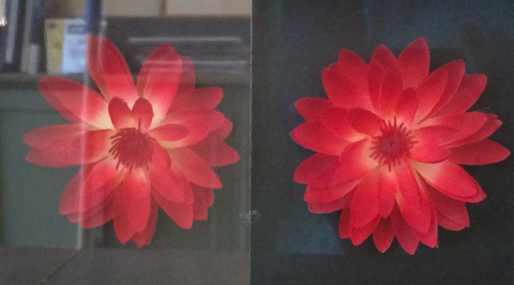
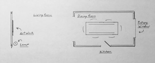
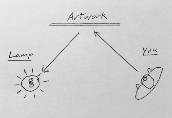
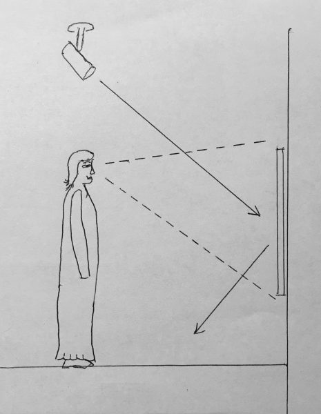
 Reflection on the Problem of Reflections


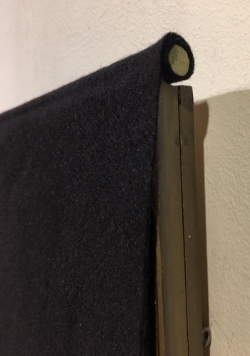 window curtains are not an option or skylights let light in that cannot be blocked. They can incorporate a weighted rod at the top that can be draped over the top of the frame with the fabric hanging over the front of the artwork. This will allow quick access to works when you want to view them and they can remain hung indefinably without overexposure to light.